A woman lying on her back in an acro yoga pose with her legs extended upward and her arms supporting her upper body, positioned in front of a large, colorful oval shape with pink, blue, and purple gradient against a cloudy sky background.

Sit down, strap in and enjoy the ride.

You’re about to enter my world.

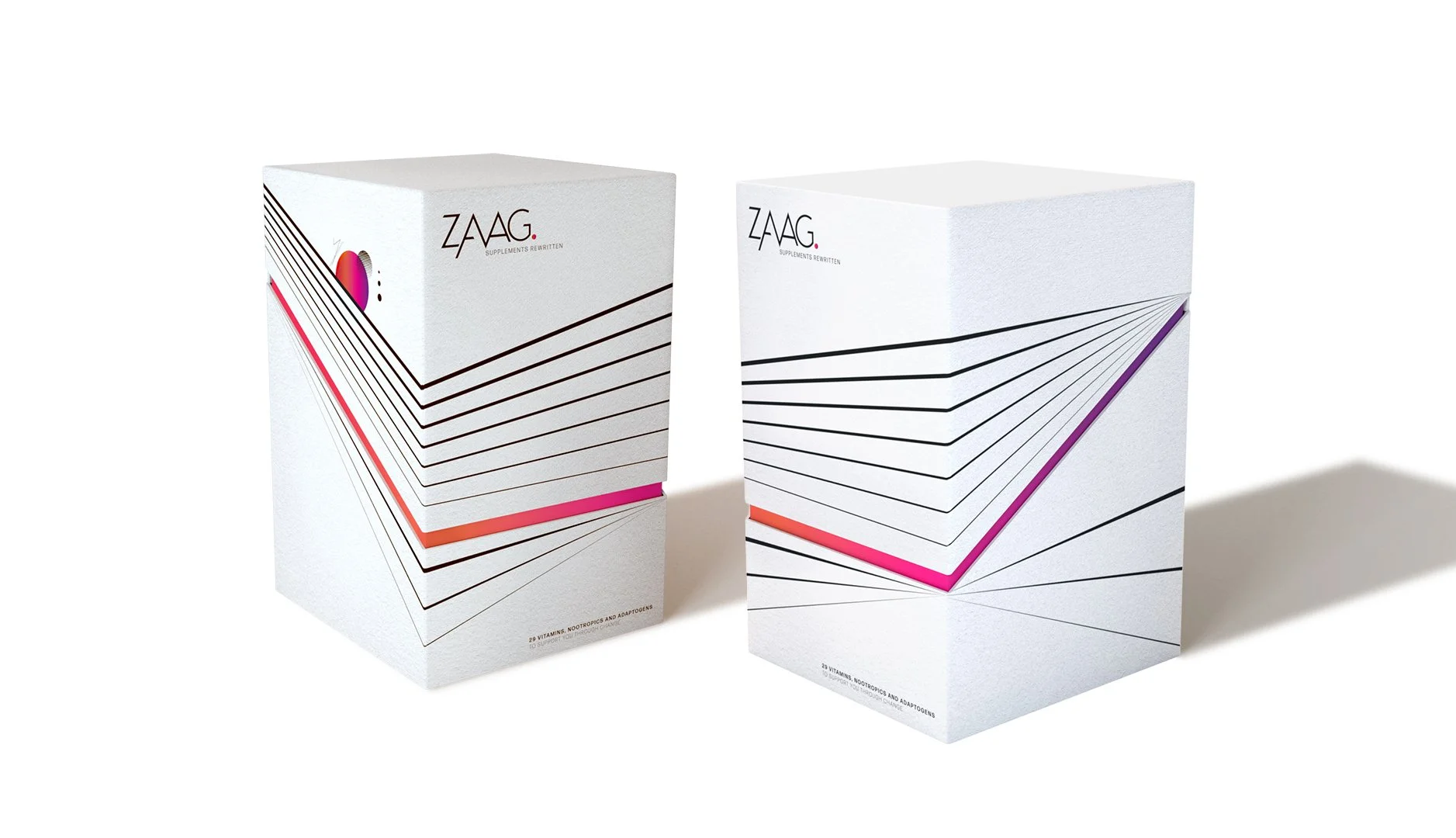
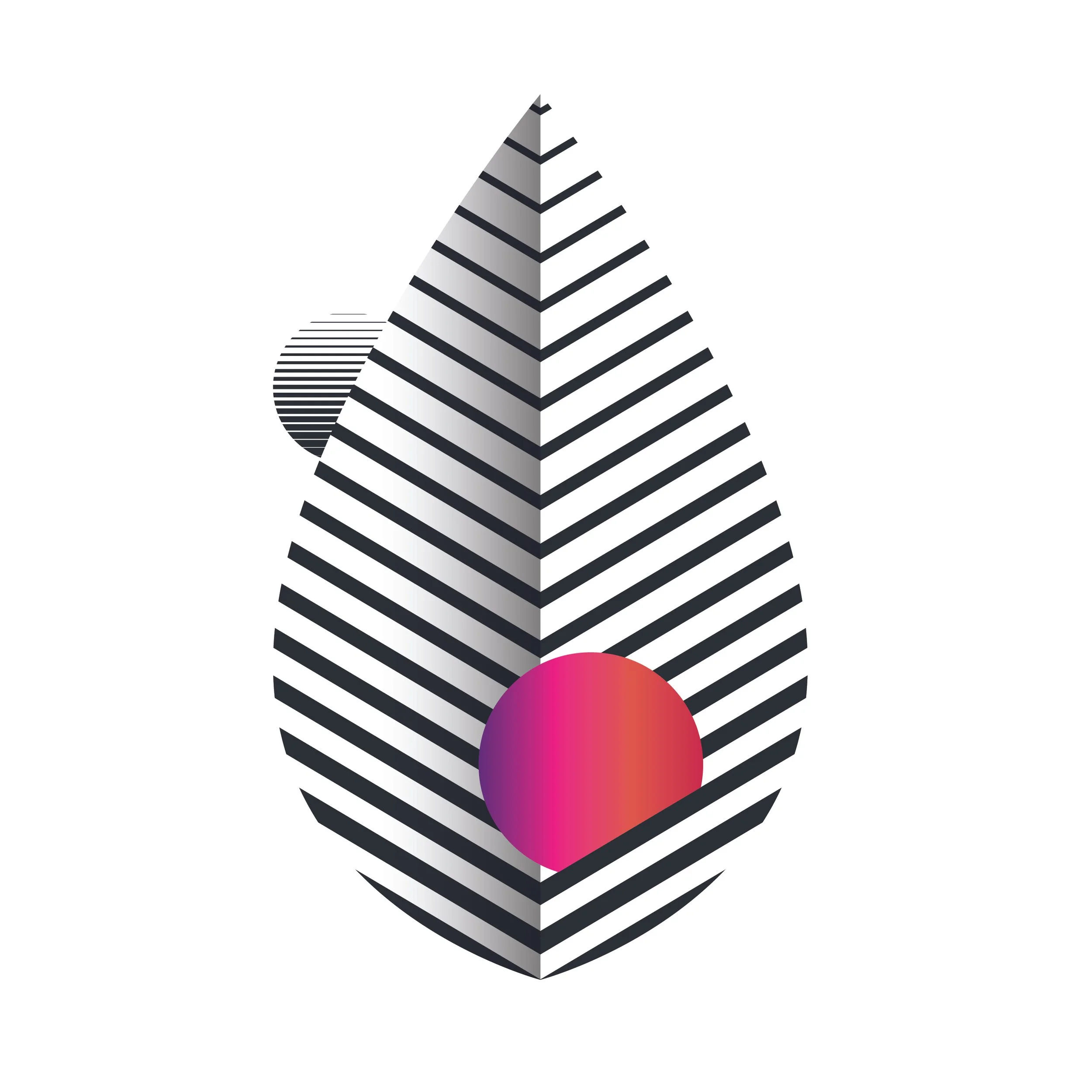
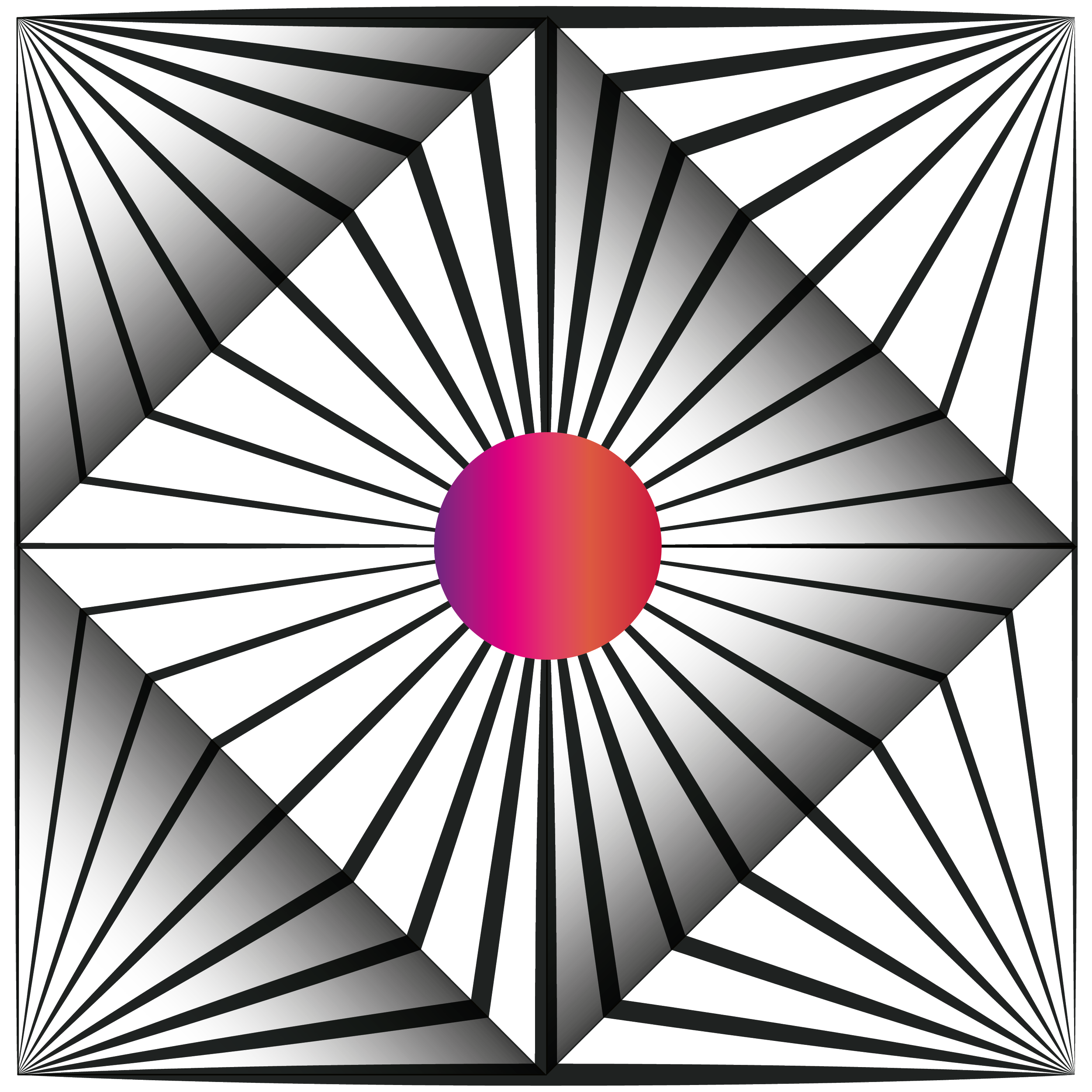
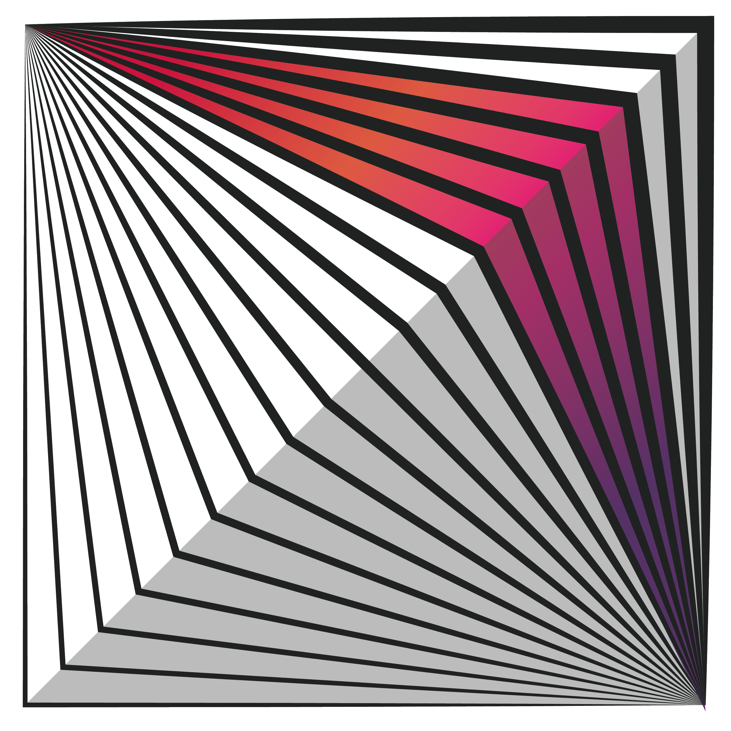
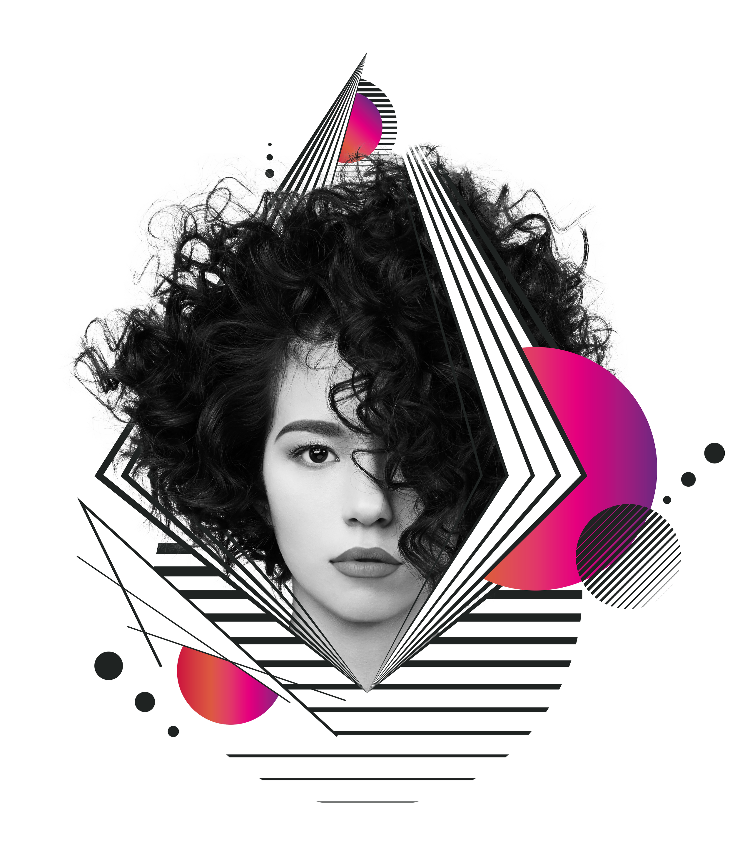
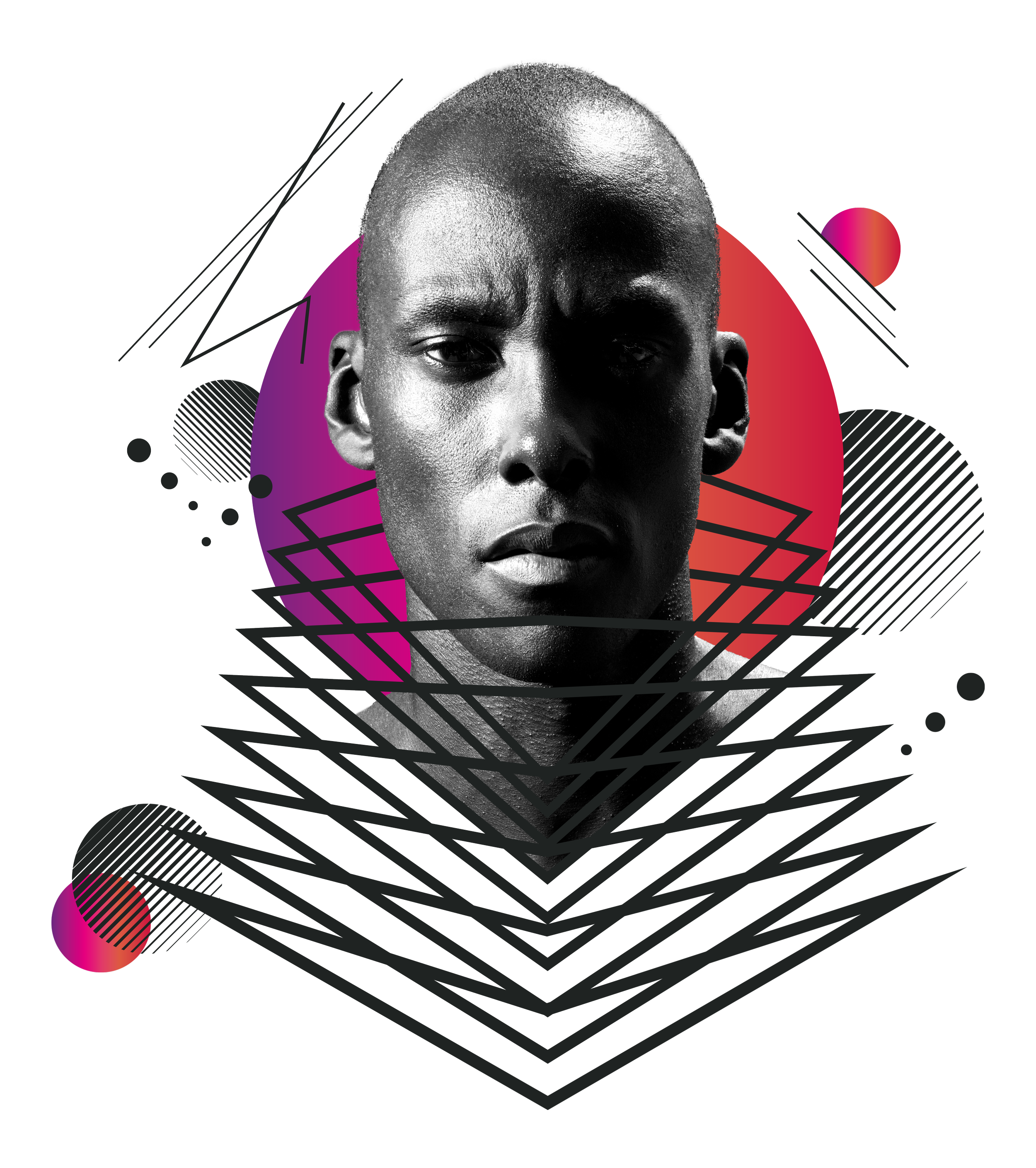
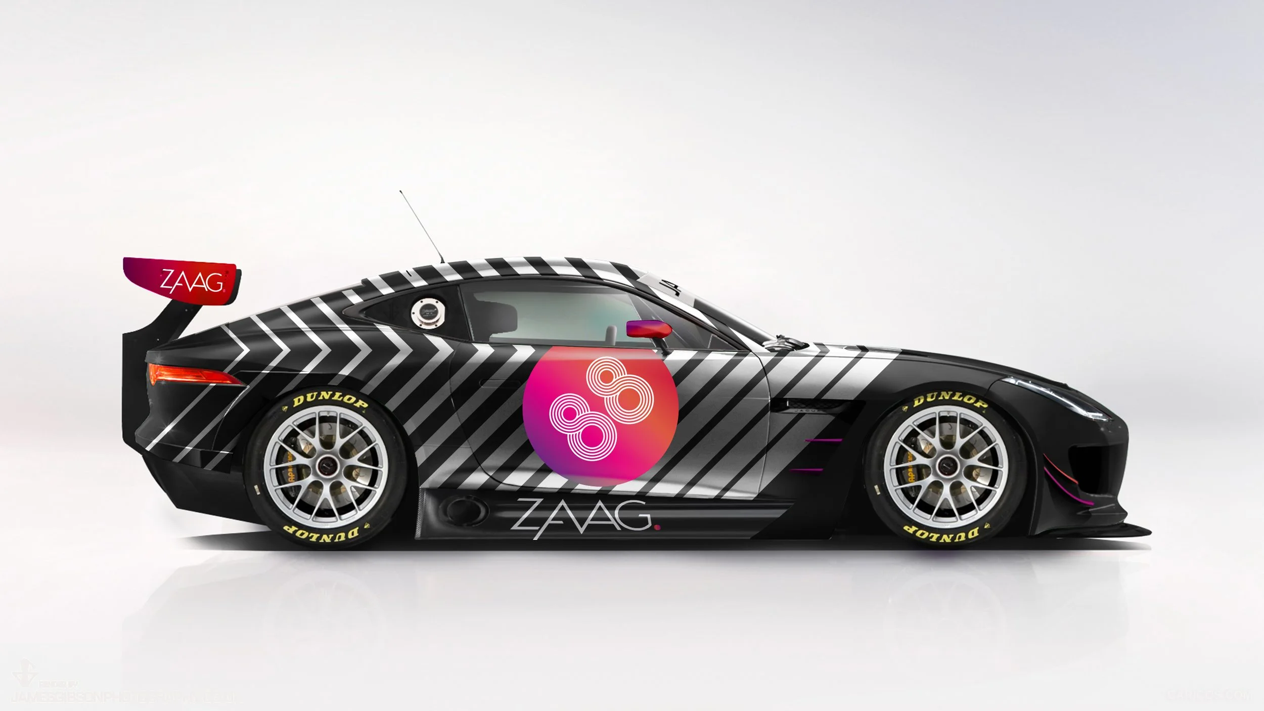
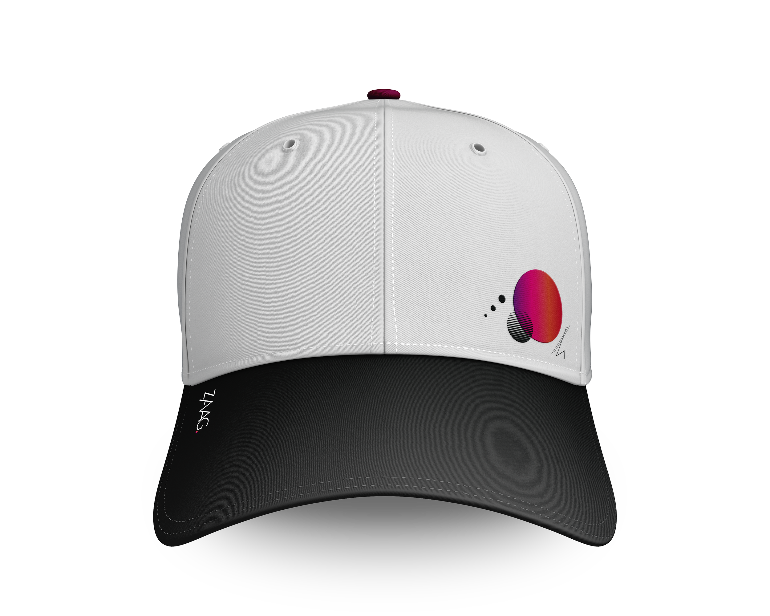
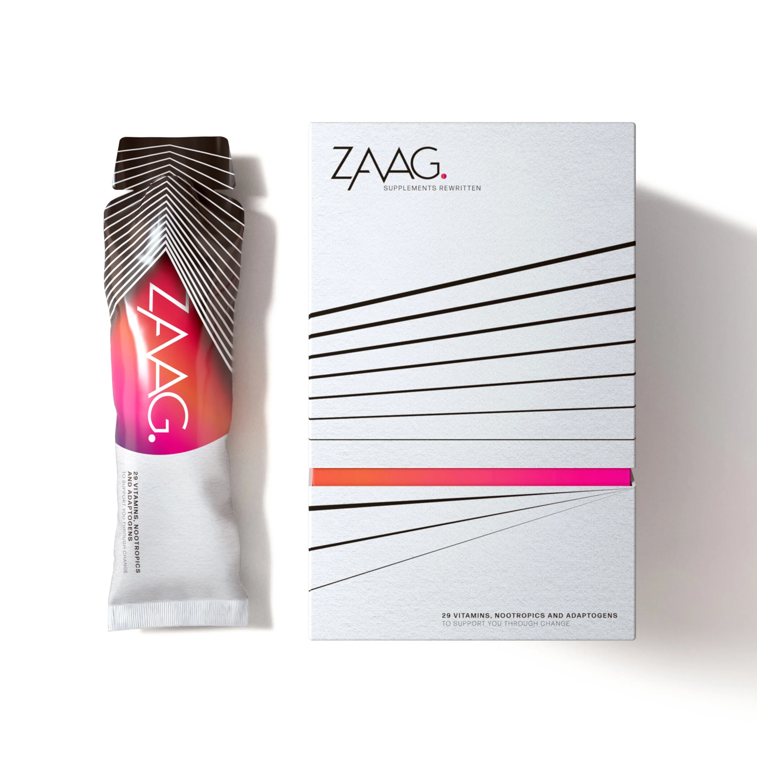
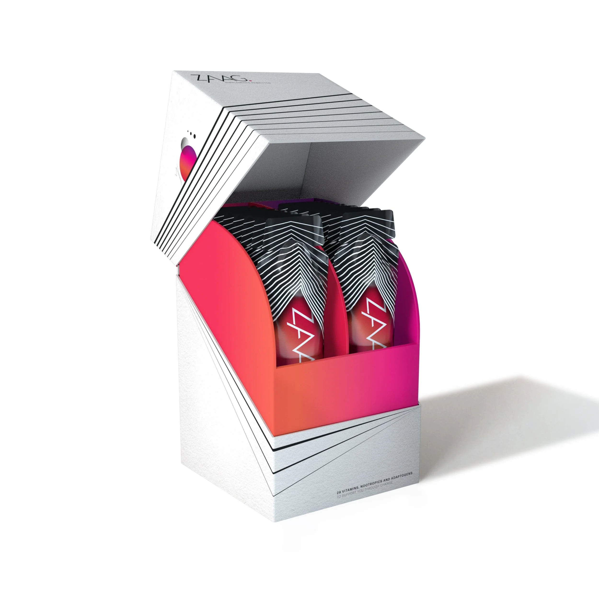
Not another supplement brand clinging on for dear life.

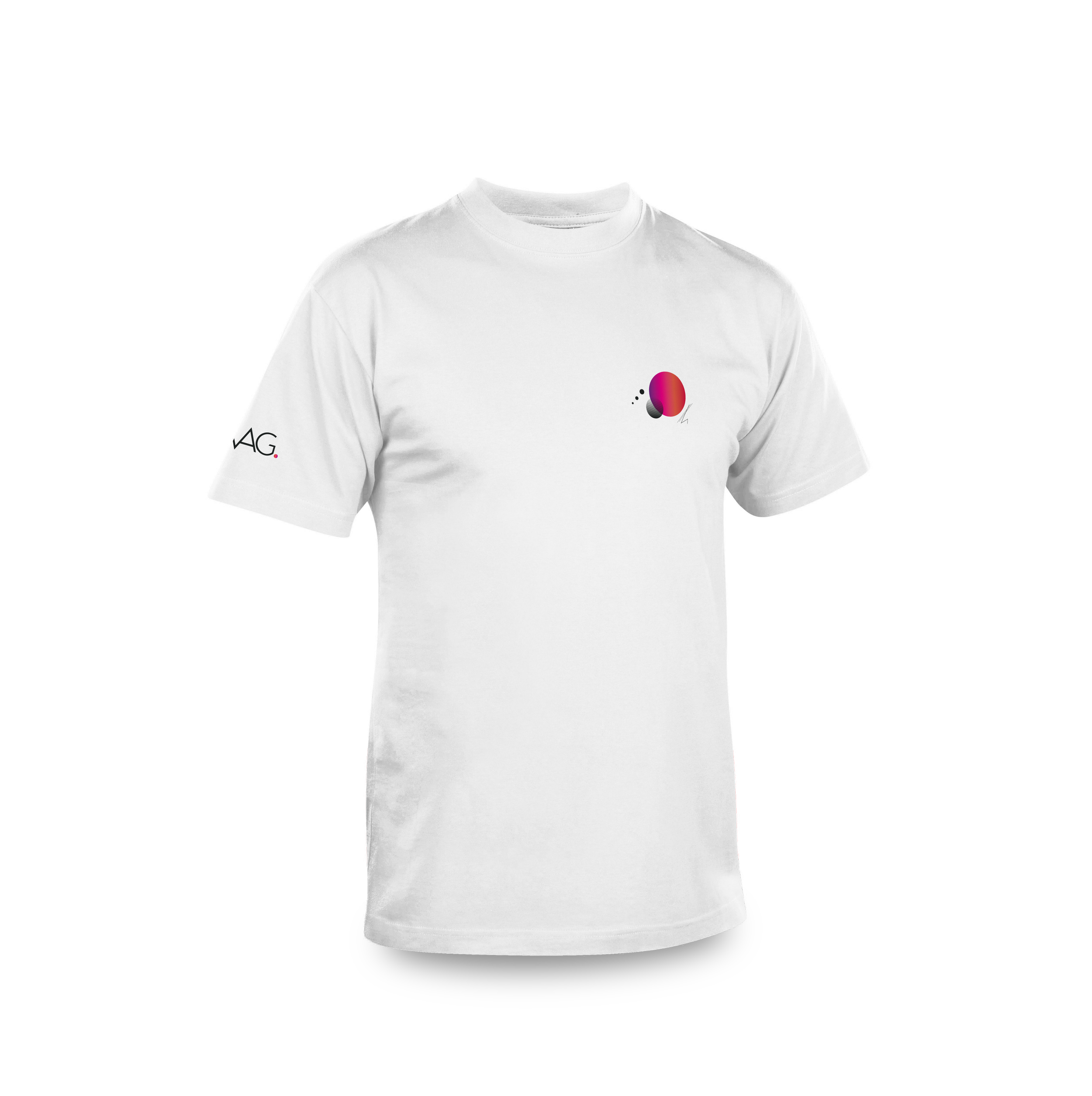
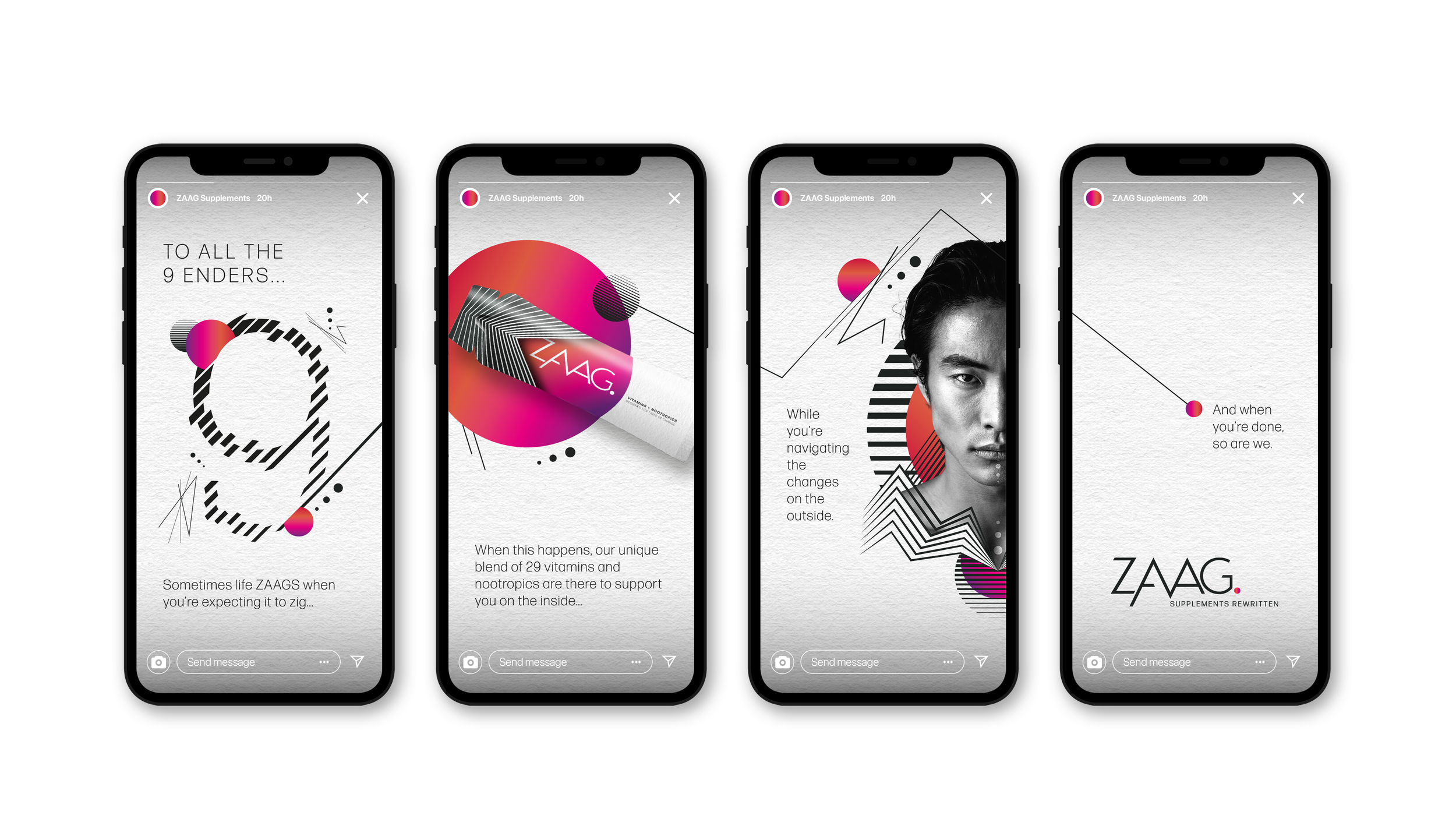
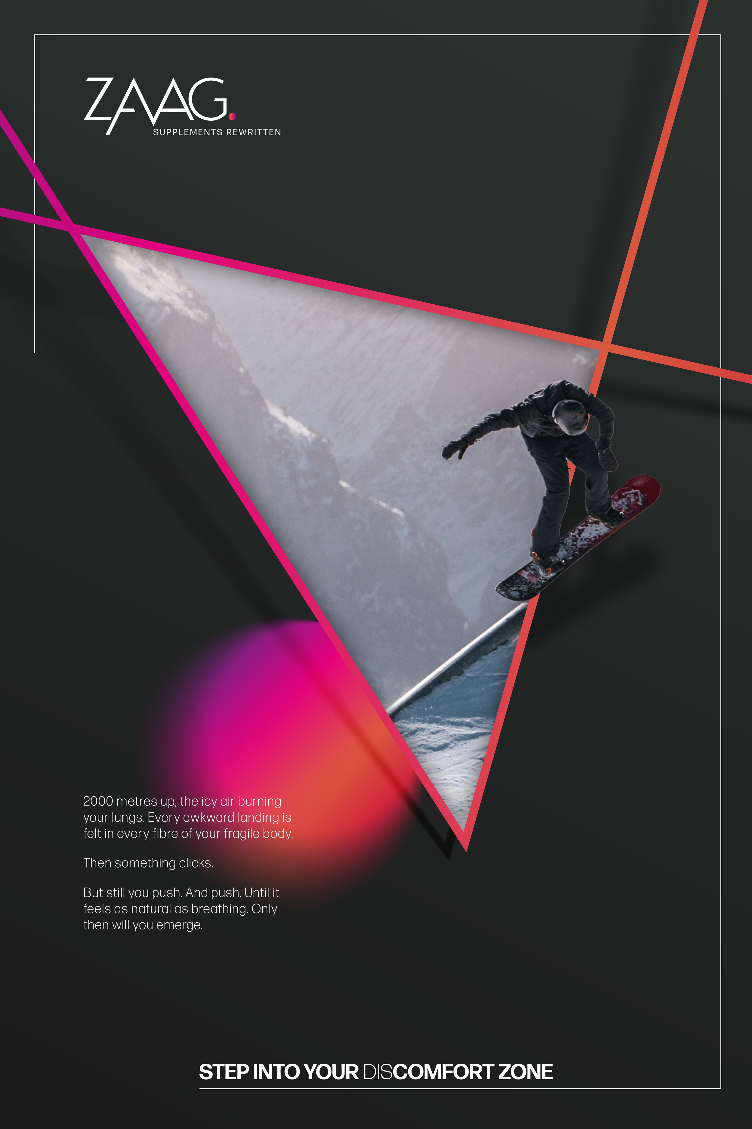
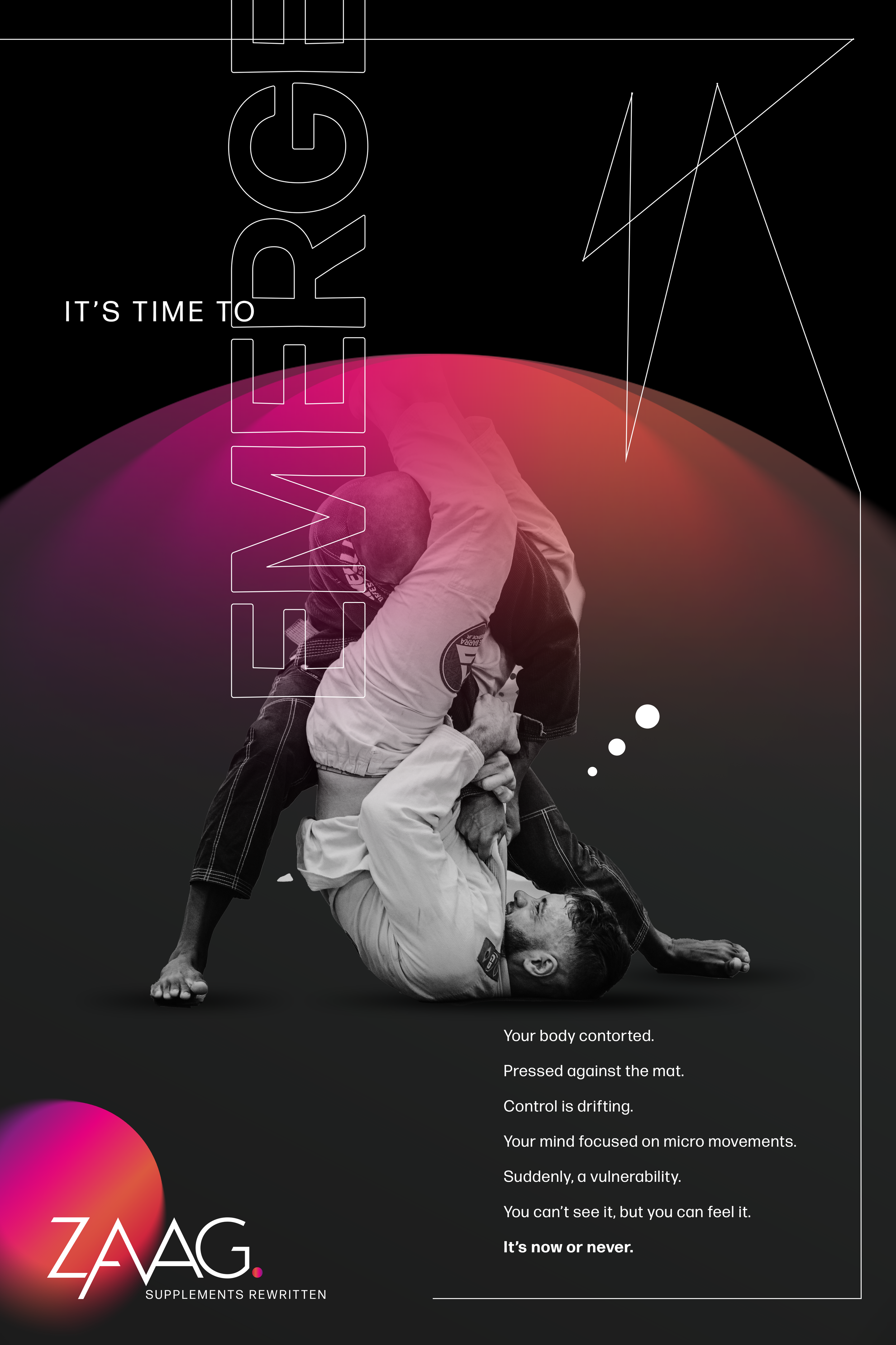
ZAAG challenges the conventions of its category, shifting the focus from long-term dependency to short-term relevance. Designed to support periods of change, it exists to be used with purpose, then let go. I developed the brand to mirror that philosophy – clean, considered and quietly assured, with a visual language that balances restraint with moments of bold expression.

Two white boxes with the word 'ZAAG' and black, pink, and purple line designs on a white background.
A black and white striped geometric pyramid with a pink and purple sphere at the base, set against a white background.
Black and gray geometric 3D shape with a pink and purple gradient sphere at the center, surrounded by linear patterns.
3D directional arrow with a red gradient, pointing to the right, surrounded by a series of black lines and white lines that create a sense of movement and depth.
People hiking on a mountain trail with a mountain peak in the background, depicted in a stylized graphic design with abstract circular and gradient elements.
Black and white photo of a woman wearing a black dress with white piping, sitting in a contemplative pose with her head bowed and eyes closed, against a geometric background with black, white, and pink gradient elements.
A person surfing on a wave, with a background divided into pink tones on the left and black-and-white on the right, with graphic pink and purple spheres and lines overlayed.
Black and white portrait of a young person with short, wavy hair, with geometric and colorful abstract shapes in the background, including a pink and orange circle and black angular lines.
Black and white portrait of a woman with curly hair, set against abstract geometric and colorful design elements.
A black and white portrait of a young person's face with a serious expression, overlaid with geometric and abstract colorful shapes and patterns in purple, red, pink, black, white, and green.
A black race car with white diagonal stripes, a pink, red, and purple circular logo on the side, and logos that read 'ZAAG' and 'DUNLOP.' The car has a prominent rear wing with the 'ZAAG' logo and yellow 'DUNLOP' tires.
A white baseball cap with a colorful, abstract logo on the side, set against a black background.
White T-shirt with a colorful abstract design on the front and text on the sleeve.
Series of four Instagram story screens from ZAAQ Supplements featuring modern, abstract graphic designs with vibrant colors, a black and white portrait of a woman, and motivational text about health and life.
A snowboarder in black clothing and a helmet riding down a snow-covered mountain slope, with a partially cloudy sky in the background. The image is stylized with a triangle overlay and vibrant pink, orange, and purple lines framing the scene.
A person in a white gi practicing Brazilian jiu-jitsu holds another person in a black gi in a ground position. The background features colorful gradient elements and text promoting a supplement brand called ZAAG, with the tagline 'Supplements Rewritten.' The image includes motivational and technical phrases about body control and movement.
Black and white photo of a female athlete holding a basketball over her shoulder, looking up. Part of her sports jersey and a digital background with text overlay. Text says, 'It's time to wake. The clock running down. The squeak of your opponents swarming around you. The distance from you and the net defined by the screams of the crowd. Yet nothing breaks your focus. It's you, the ball, the net. In this moment, nothing else matters. This is when you emerge.' The logo at the bottom reads 'ZAAG Supplements Rewritten.'
Black and white image of a person on a skateboard, sitting with one arm extended, wearing sportswear and sneakers, surrounded by colorful gradient circles and abstract lines.
Black and white photo of a woman with short hair in a side profile, with digital and geometric design elements overlaying the image, including colorful accents of pink, red, and black.
A white box with black diagonal lines and the word 'ZAAG' printed on it, placed next to a black and white box with the label 'SUPPLEMENTS REWRITTEN', and a tube with a colorful gradient design and the word 'ACID' on it.
A box designed to look like a vintage television set, with a white and gray exterior, black and white zigzag pattern on the screen area, and a section with pink and purple coloring, containing 29 vitamins, nootropics, and adaptogens.

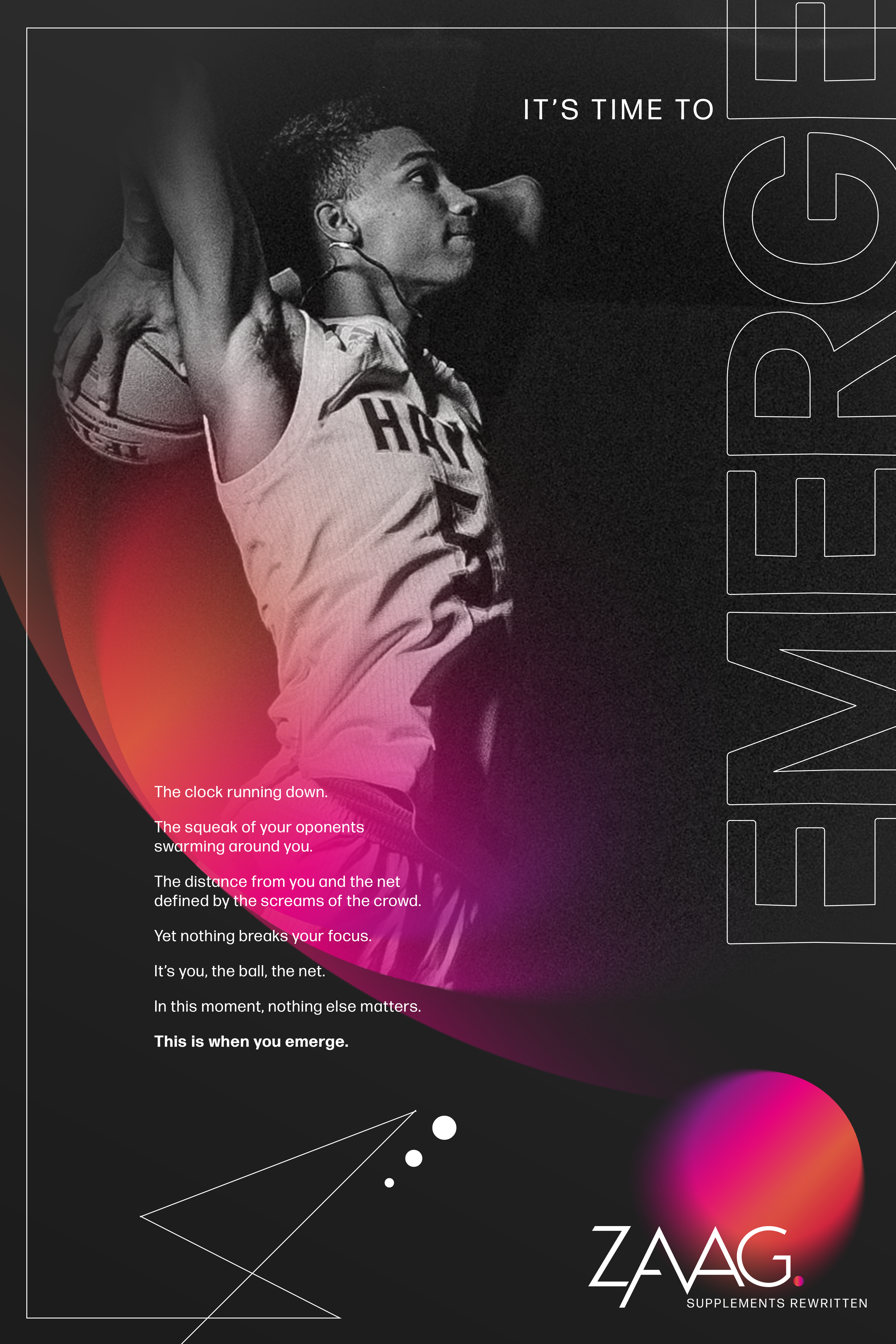
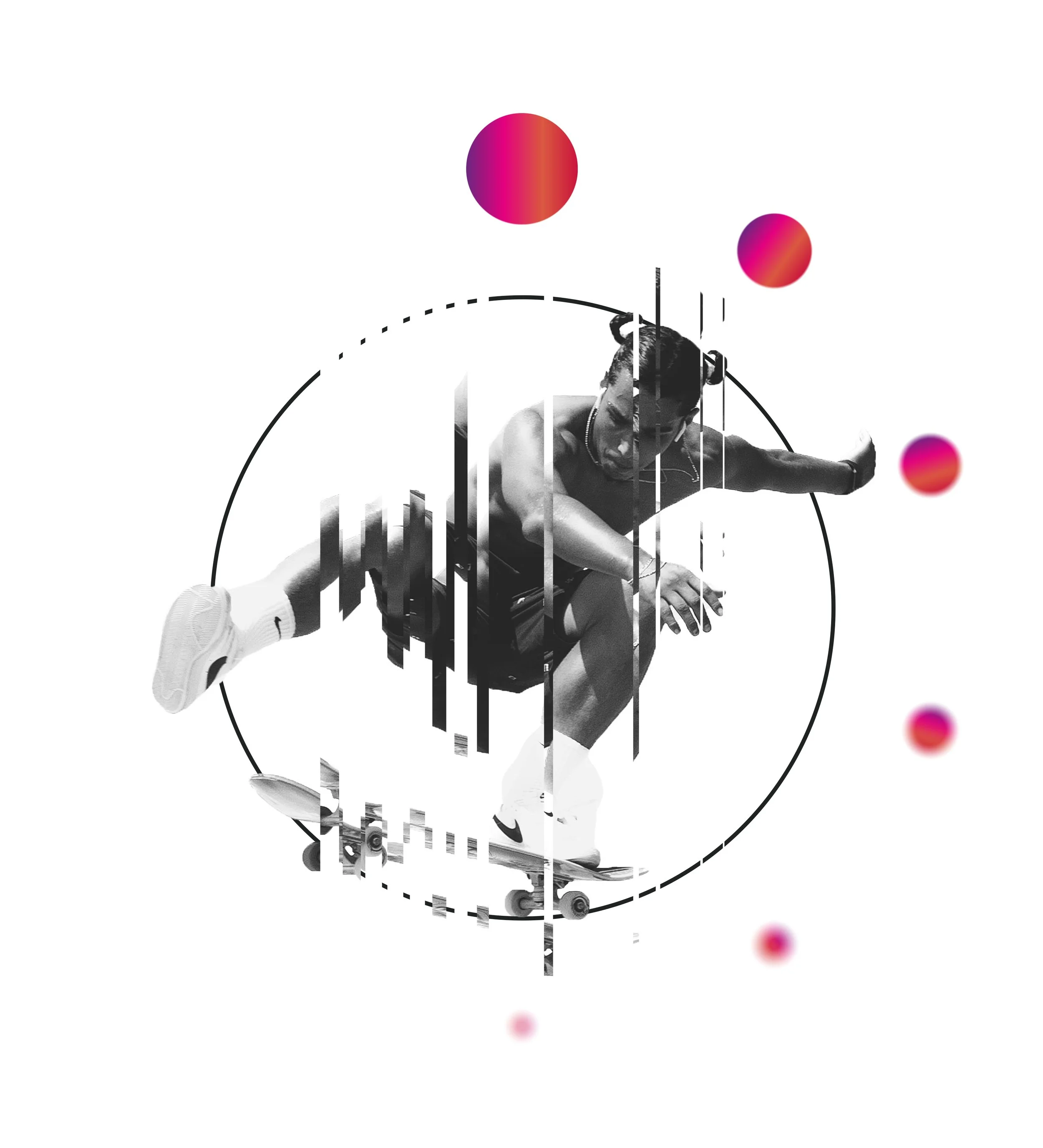
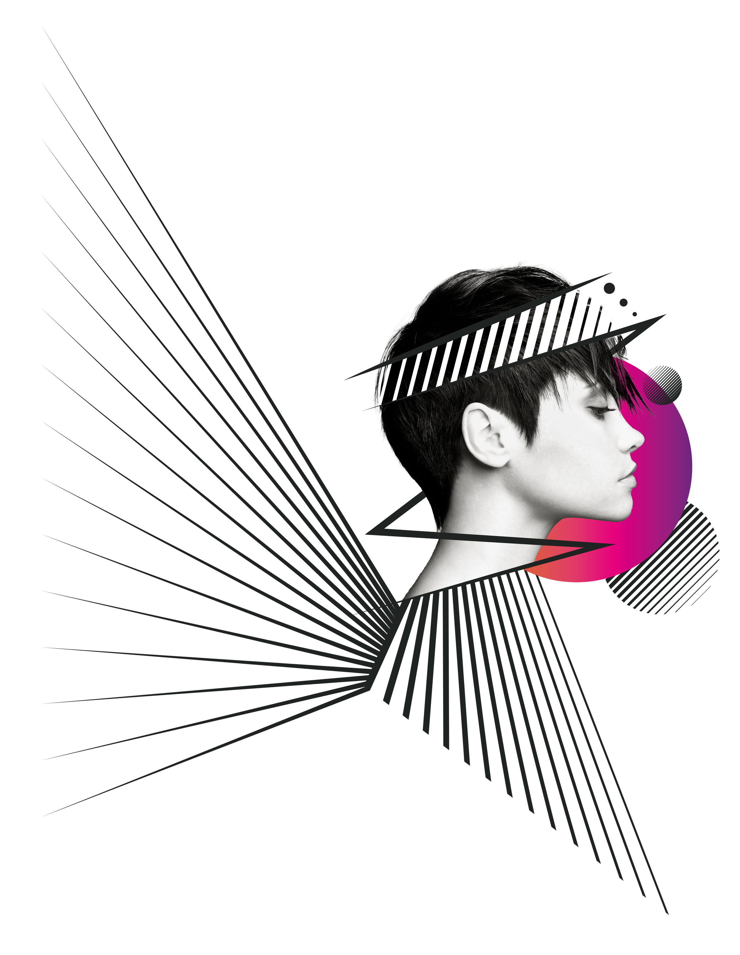
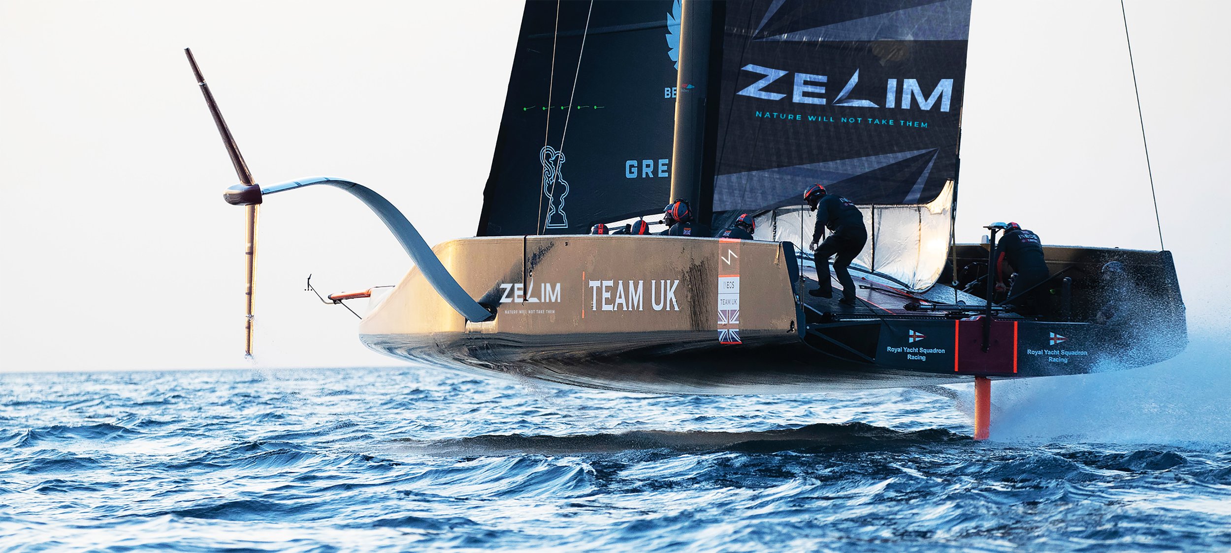
Designed for when everything is on the line.

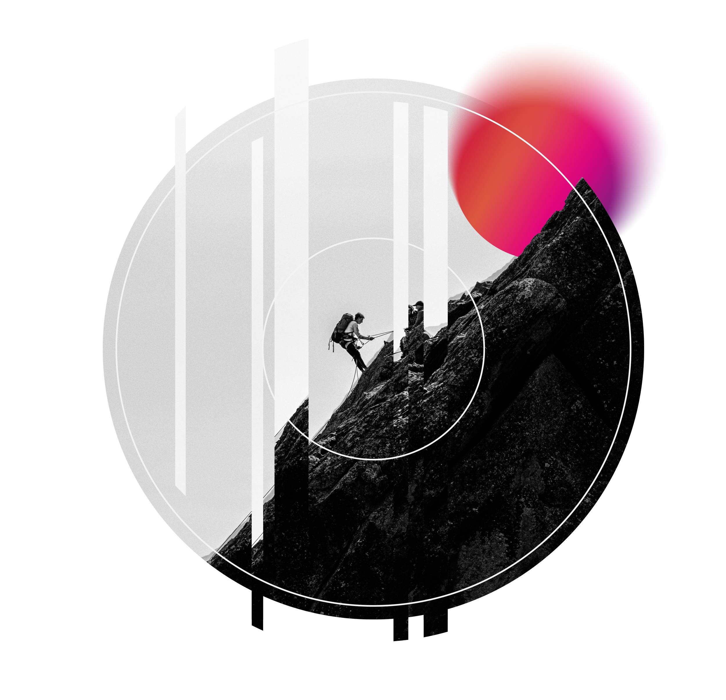
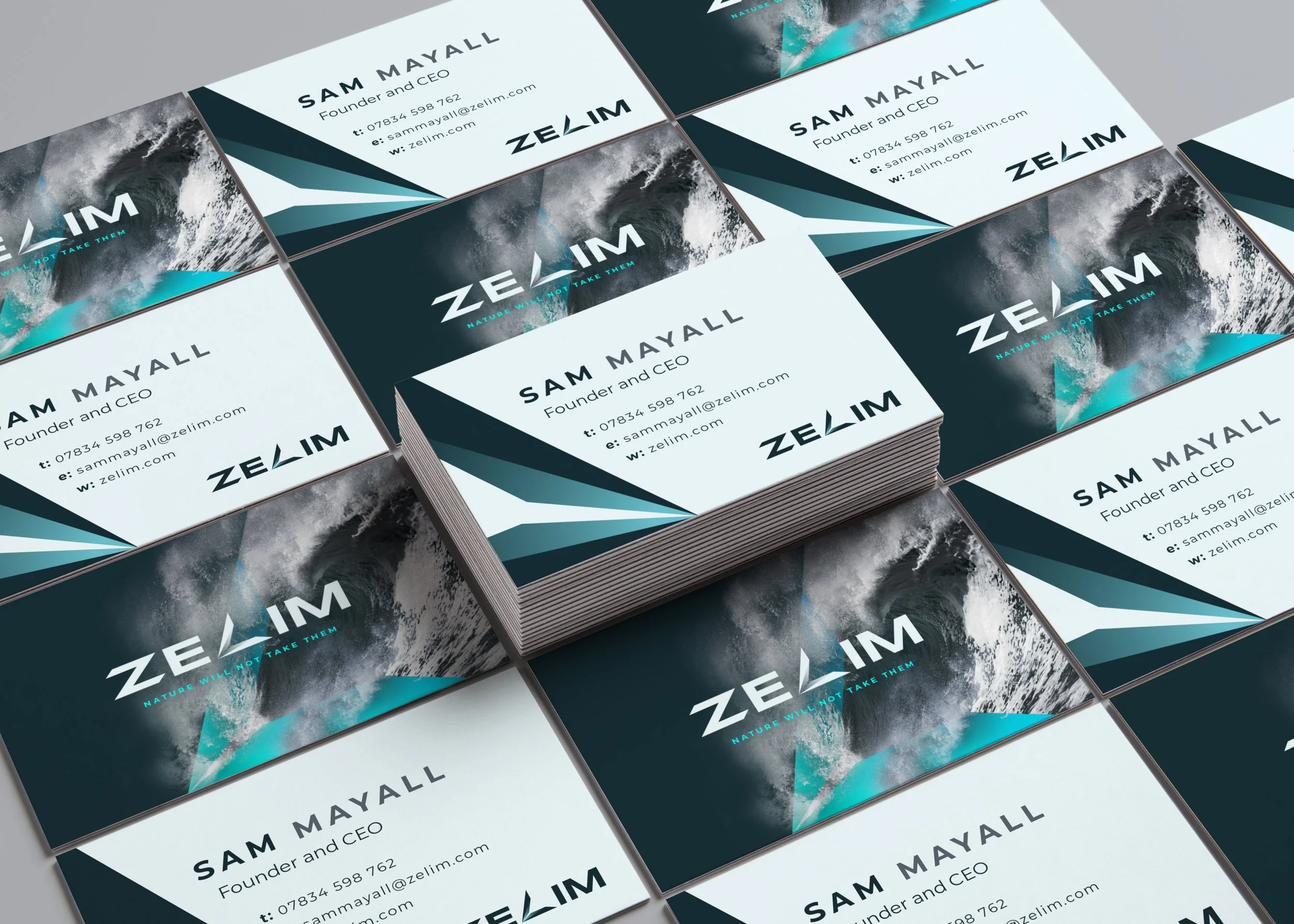
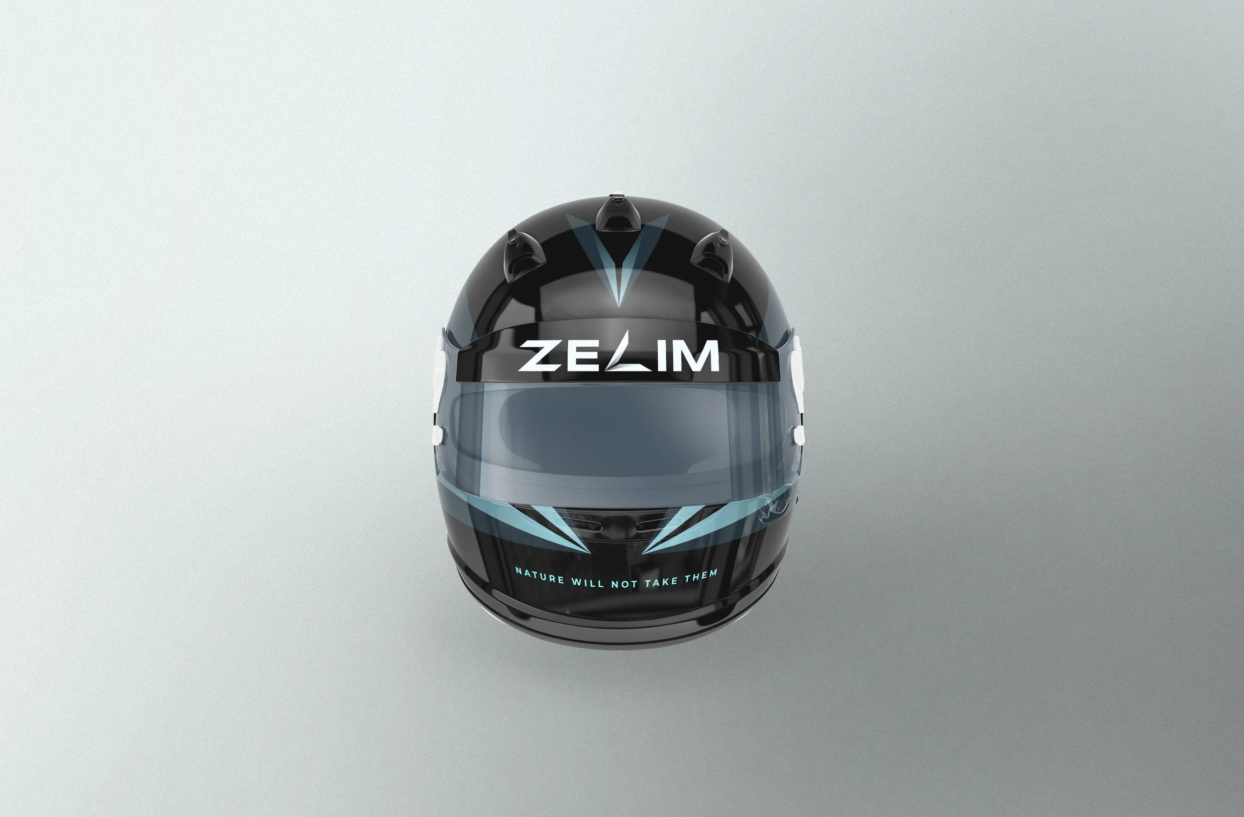
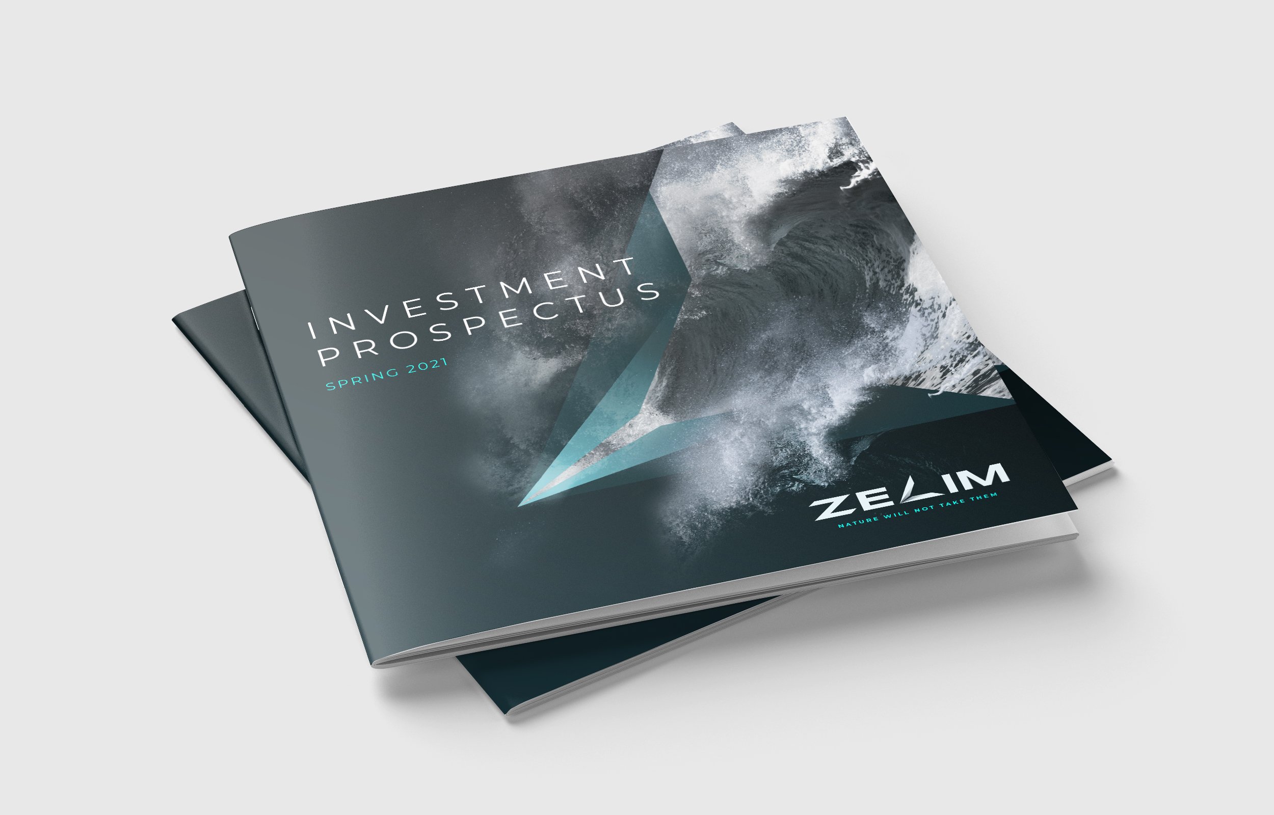
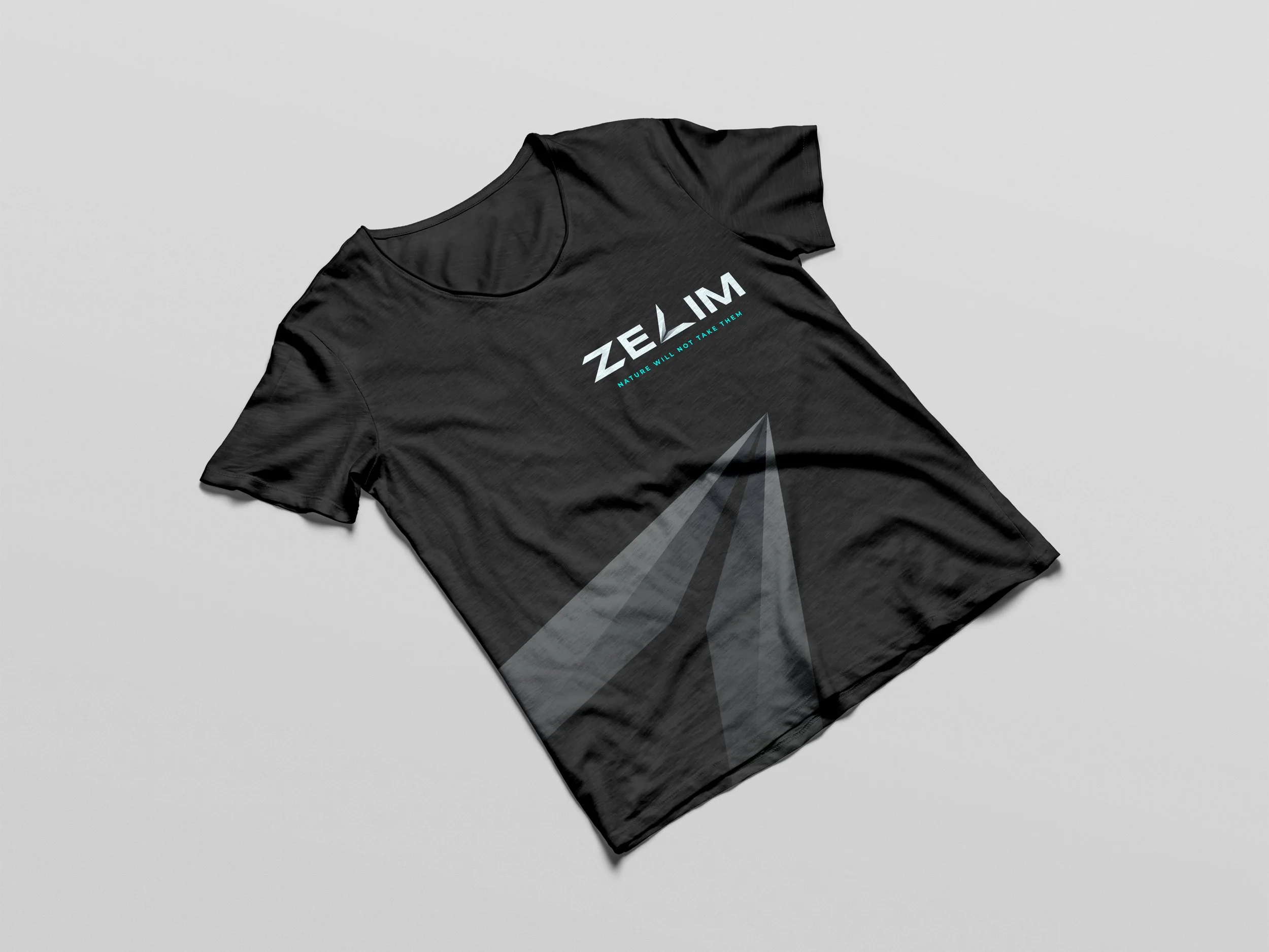
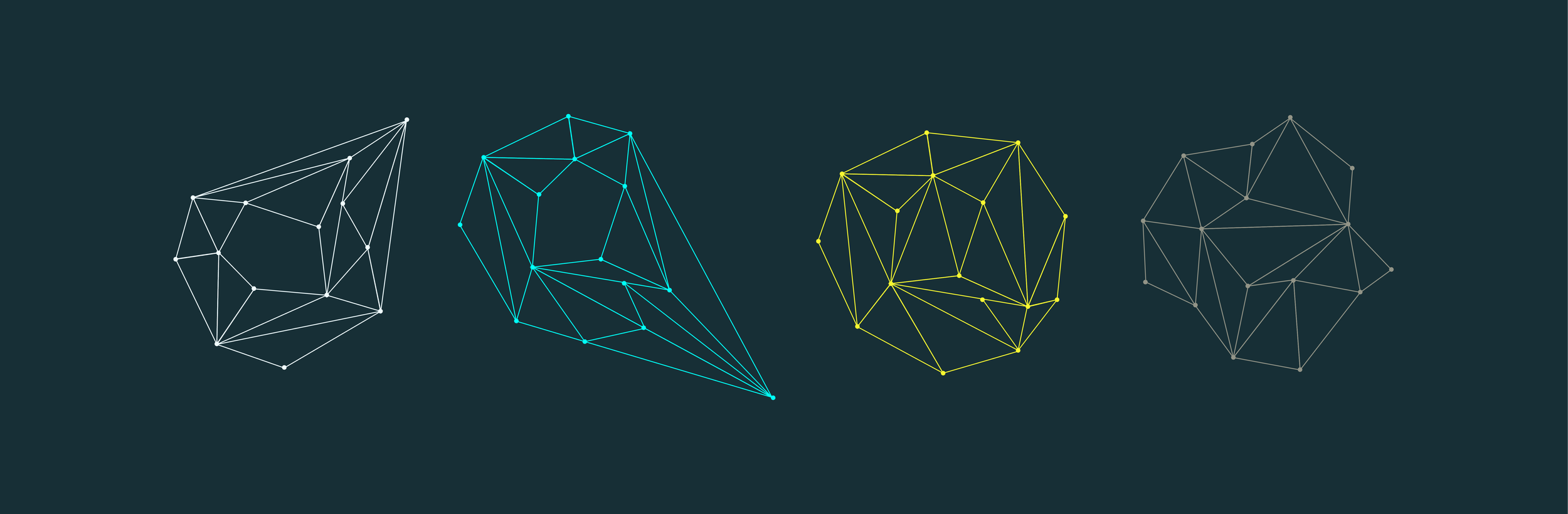
Zelim’s technology exists to find, recover and protect people in the most critical moments – using intelligent systems to detect incidents instantly and support life-saving intervention at sea. I was responsible for the full brand creation, from naming through to identity, crafting a system that communicates urgency, trust and precision in equal measure. It’s serious work, solving a serious problem – so the brand needed to be clear, confident and free of anything that might get in the way. No fluff. No drama. Just something that does its job when it matters most.

Digital illustration of a computer monitor with a stylized shield icon and a glowing blue bar at the bottom.
A digital artwork featuring a large ocean wave with a geometric overlay. The text 'ZELIM' is written with a stylized design, and the tagline 'NATURE WILL NOT TAKE THEM' appears below in blue.
Digital illustration of various geometric shapes and wireframes on a dark background.

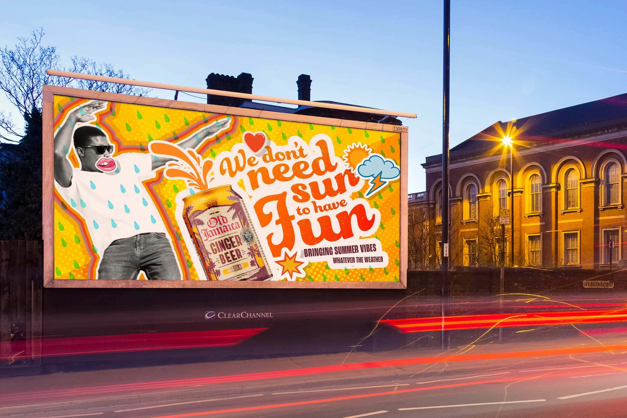
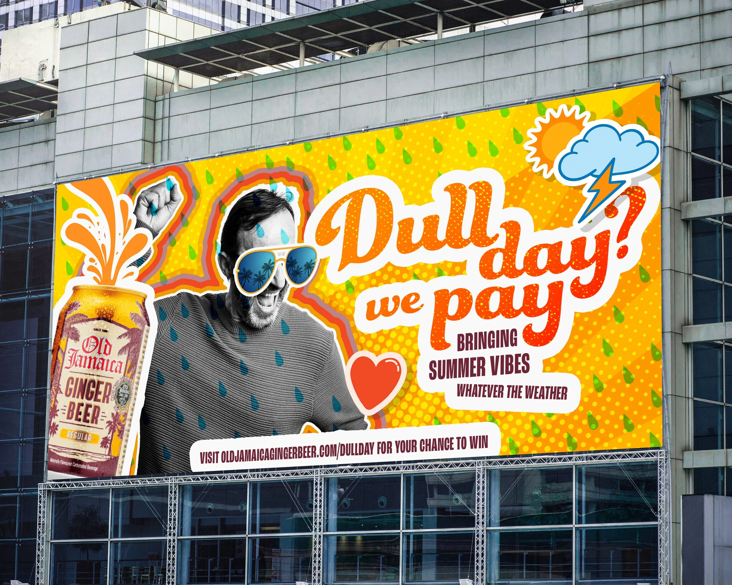
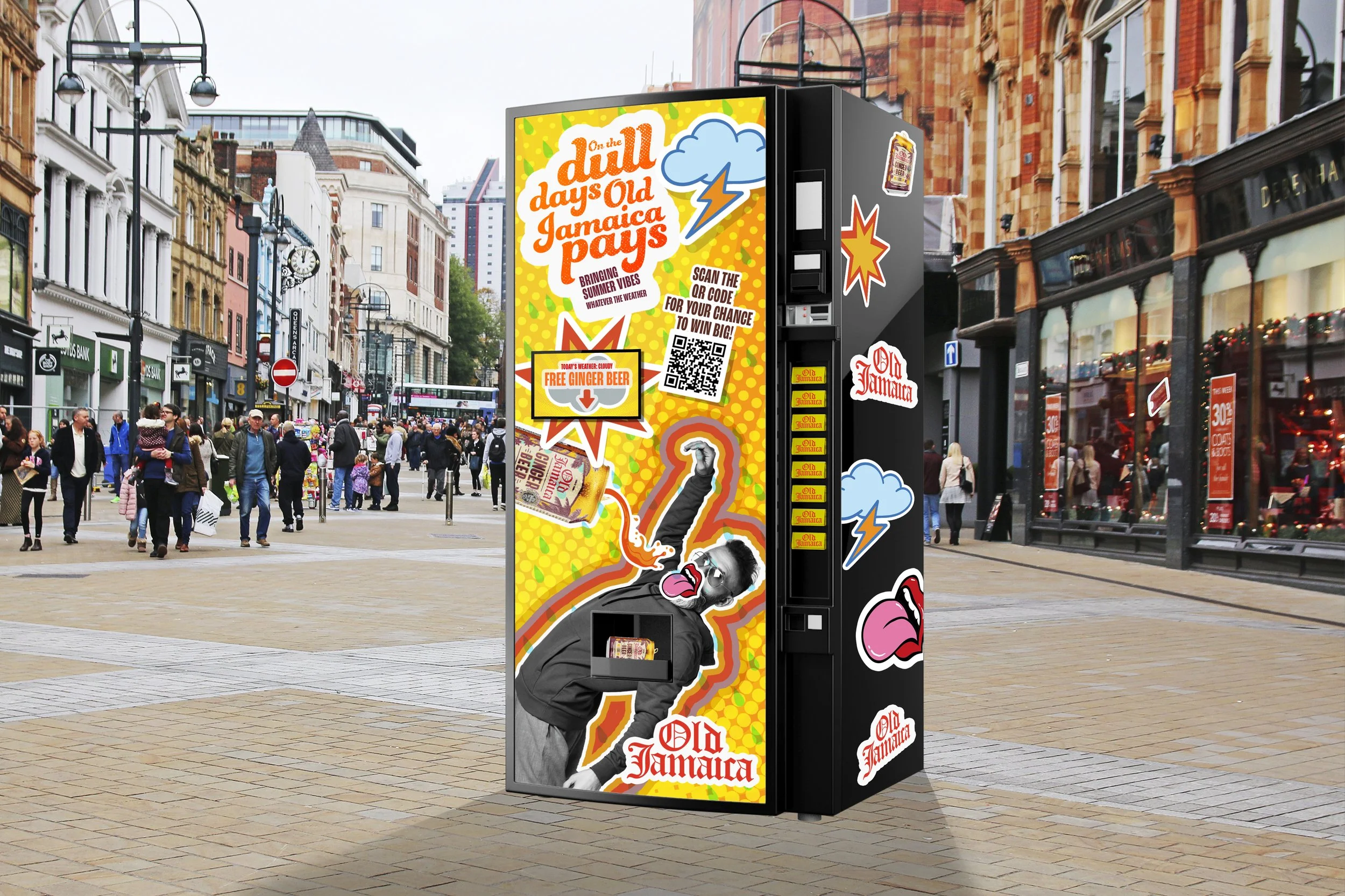
Spicy work for a spicy brief.

Threw some visuals together for an Old Jamaican Ginger Beer pitch. We had fun. They looked good. That's the whole story.

A colorful billboard advertises summer drinks and fun, featuring a woman with sunglasses, holding her hands up, with a background of rain droplets and graphics of a ginger beer bottle and weather icons.
A colorful outdoor billboard featuring a man with sunglasses, a raised fist, and rain drops on his face, advertising Old Jamaica Ginger Beer. The billboards background has a bright yellow with green leaves and various icons including a sun, cloud, and lightning bolt, and the text promotes a summer promotion.
A vending machine on a busy city street with colorful pop art-style stickers including children, rain clouds, lightning, and text promoting Old Jamaica beer and free ginger beer, surrounded by pedestrians and buildings.

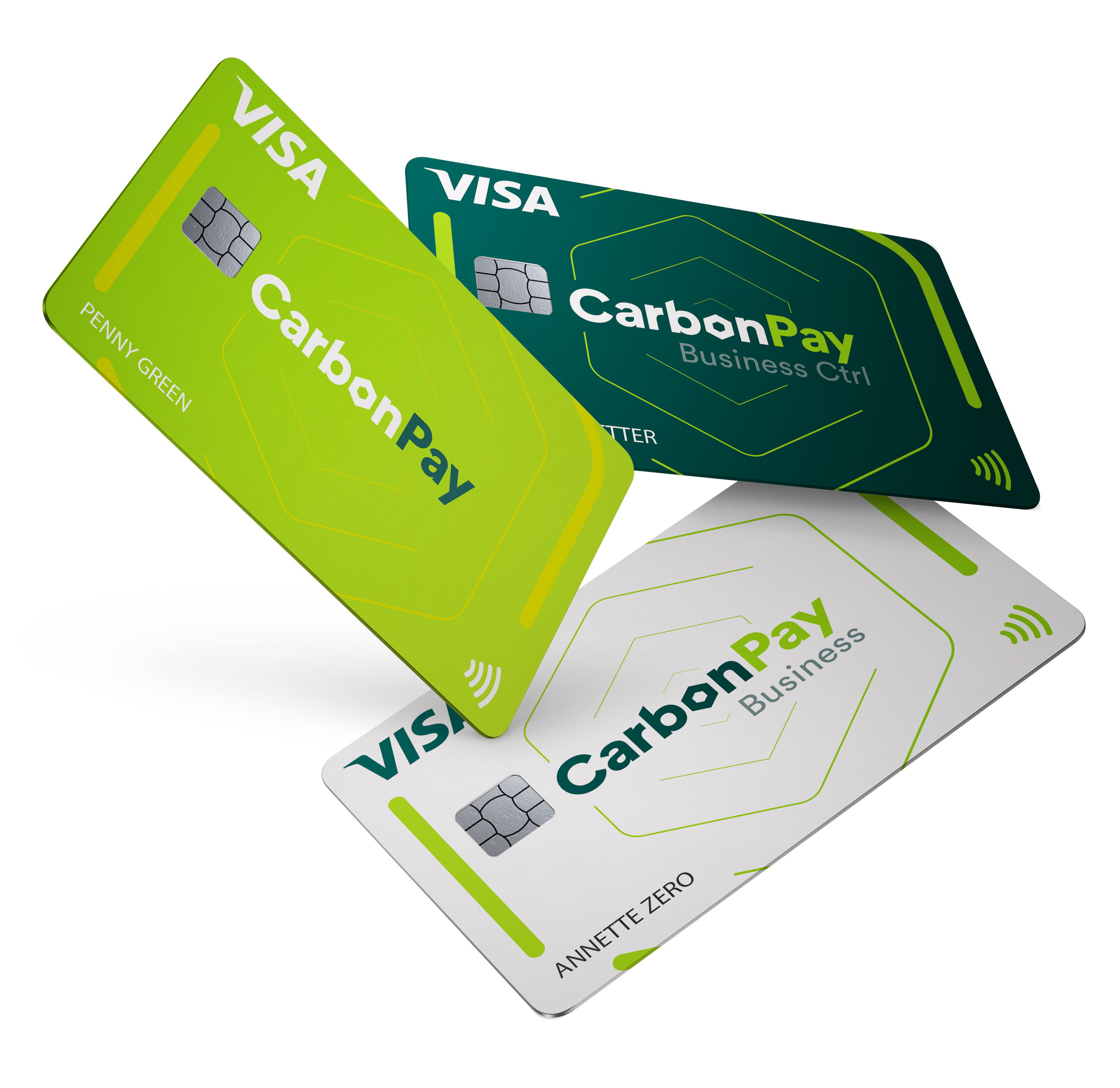
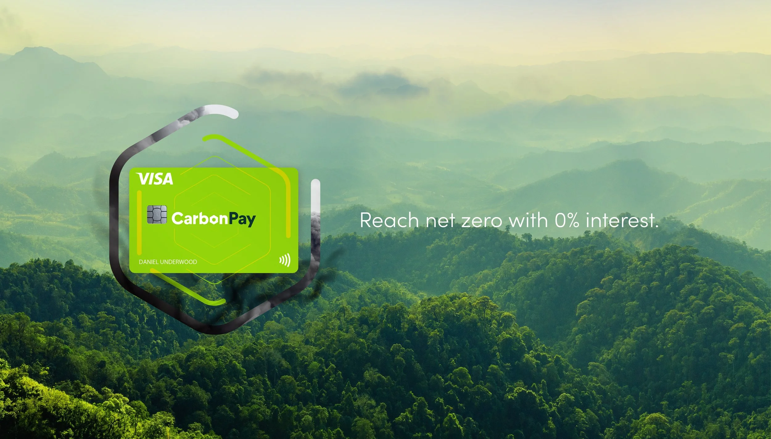
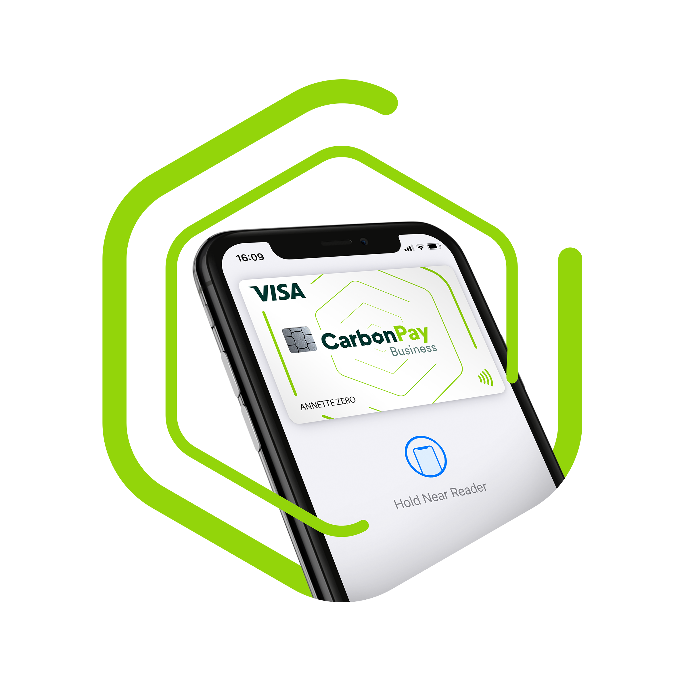
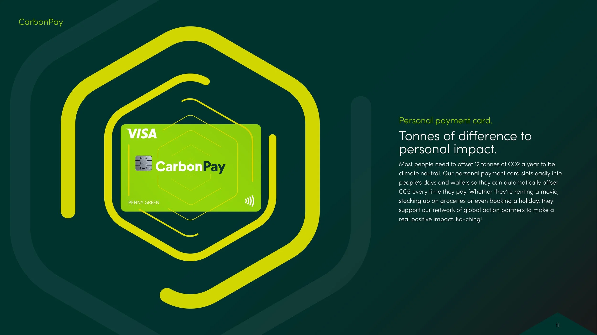
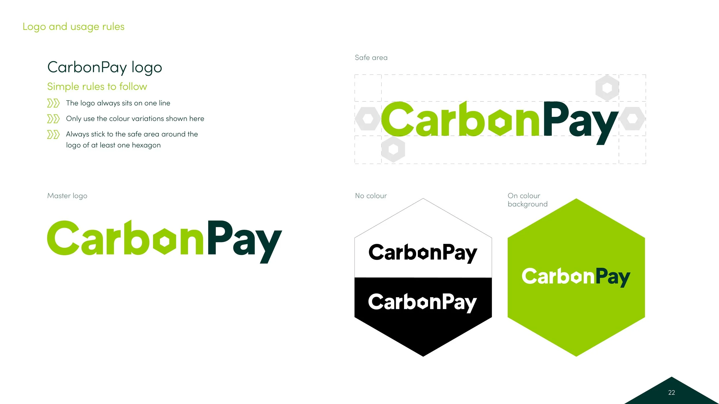
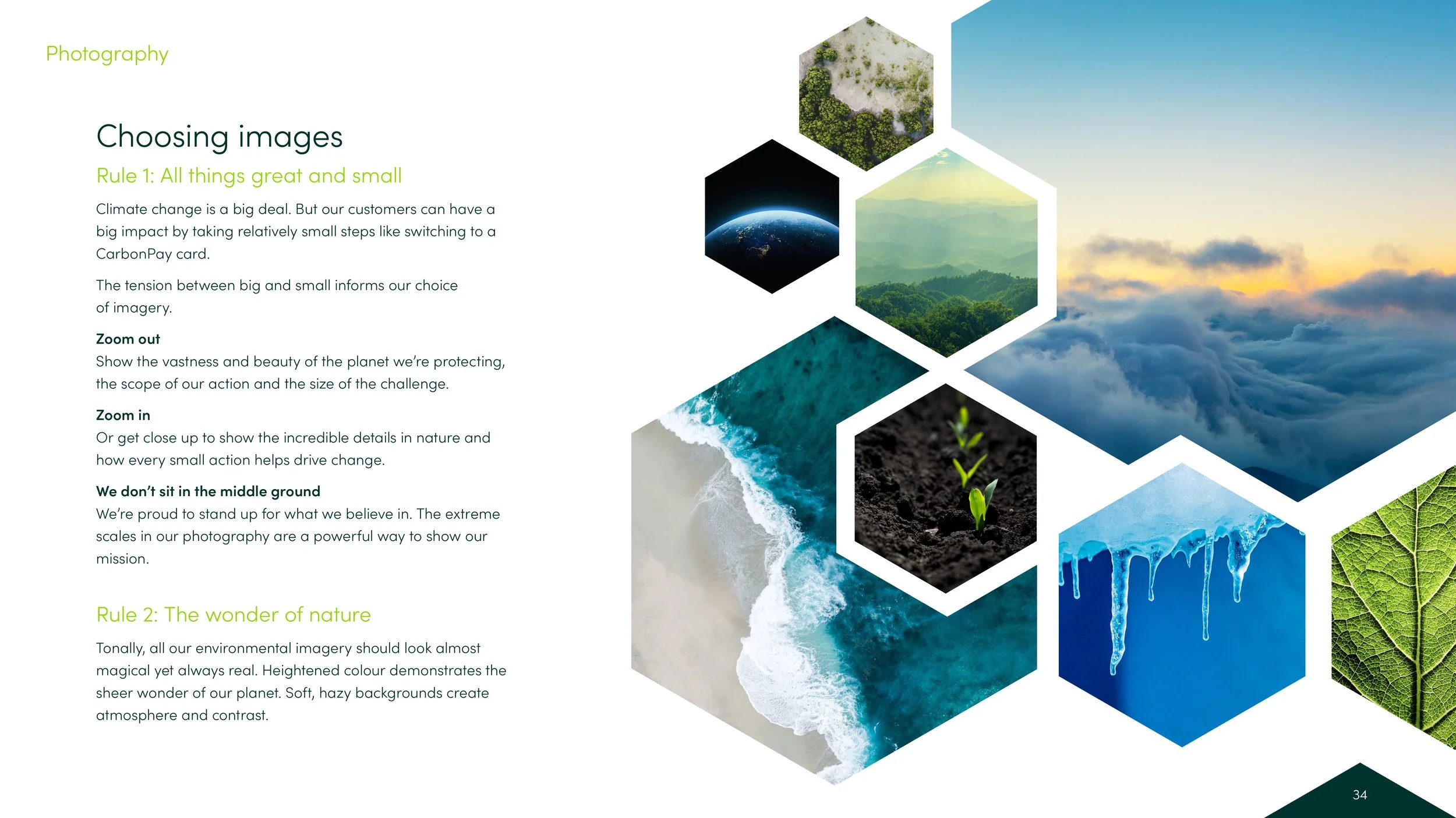
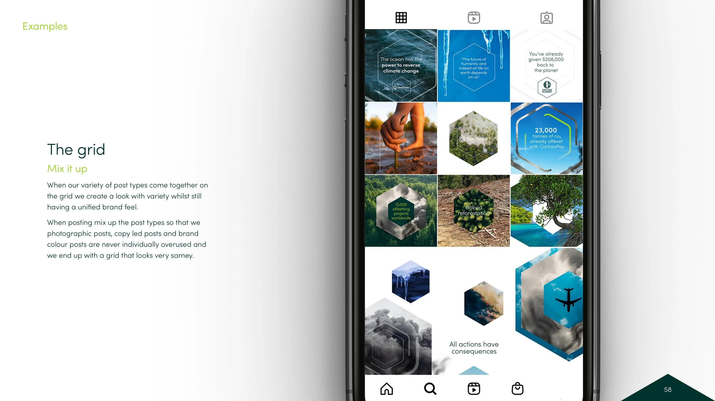
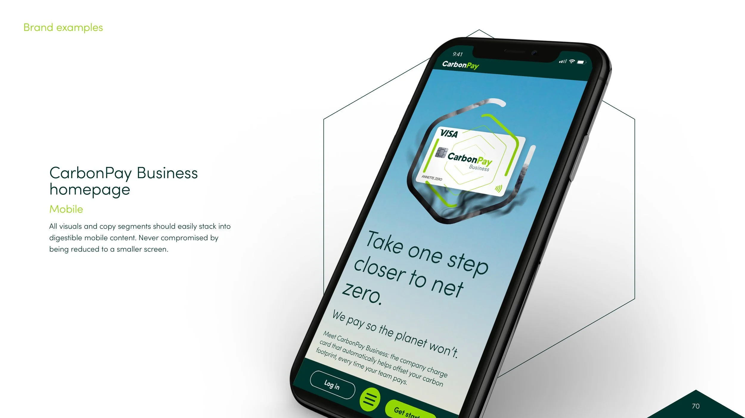
Where finance meets responsibility.

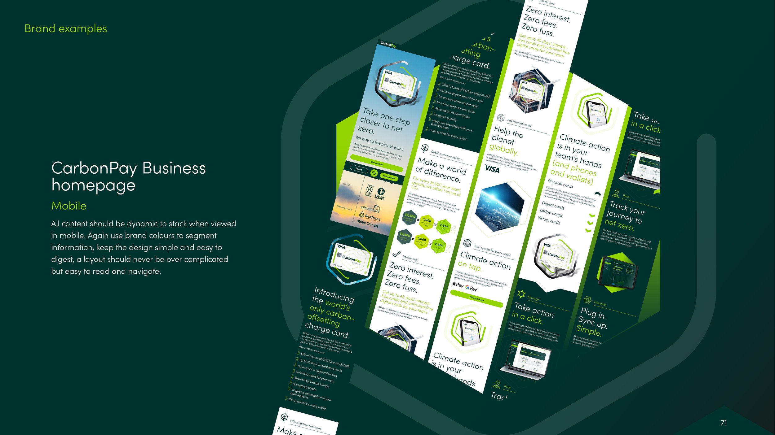
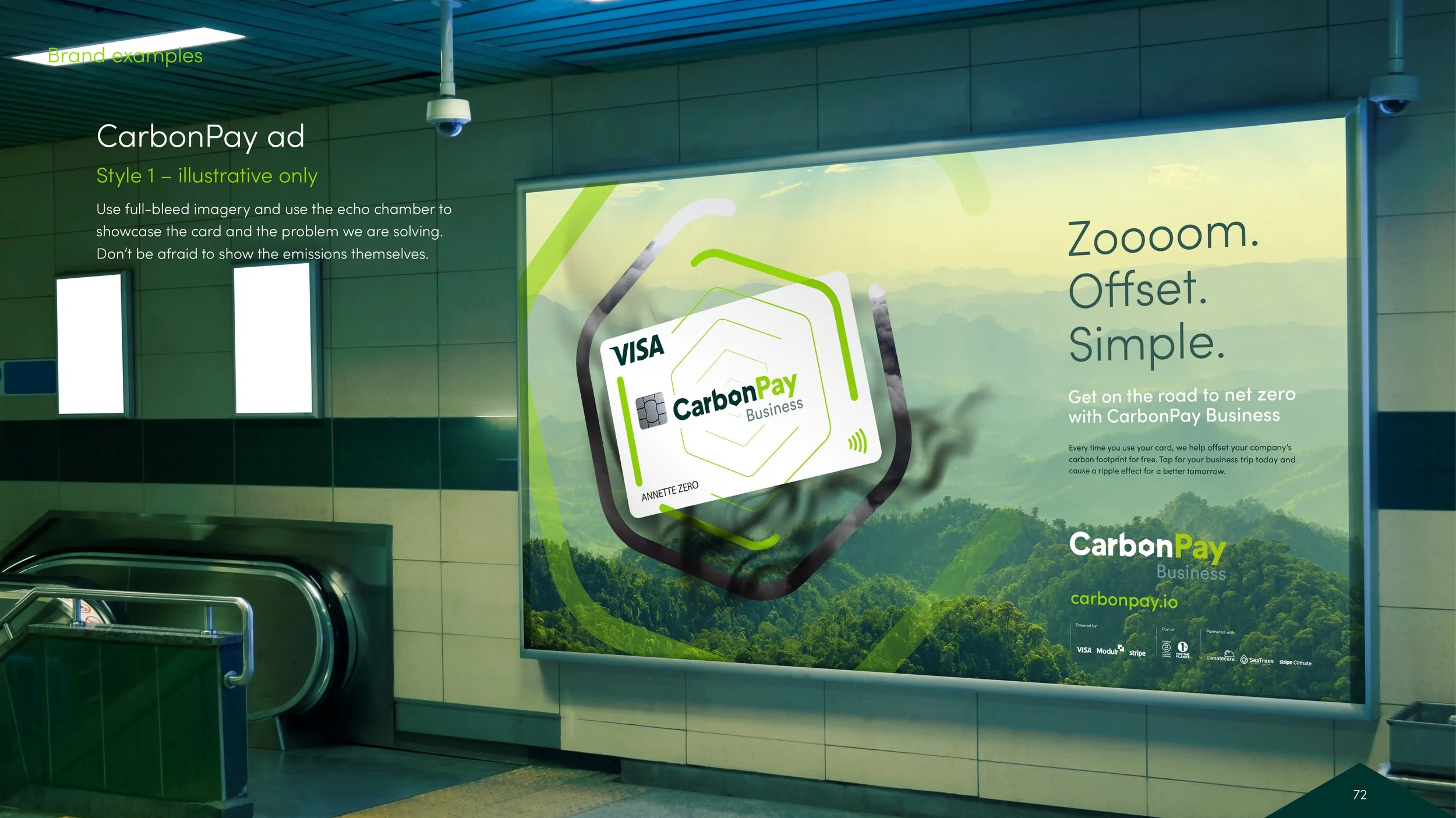
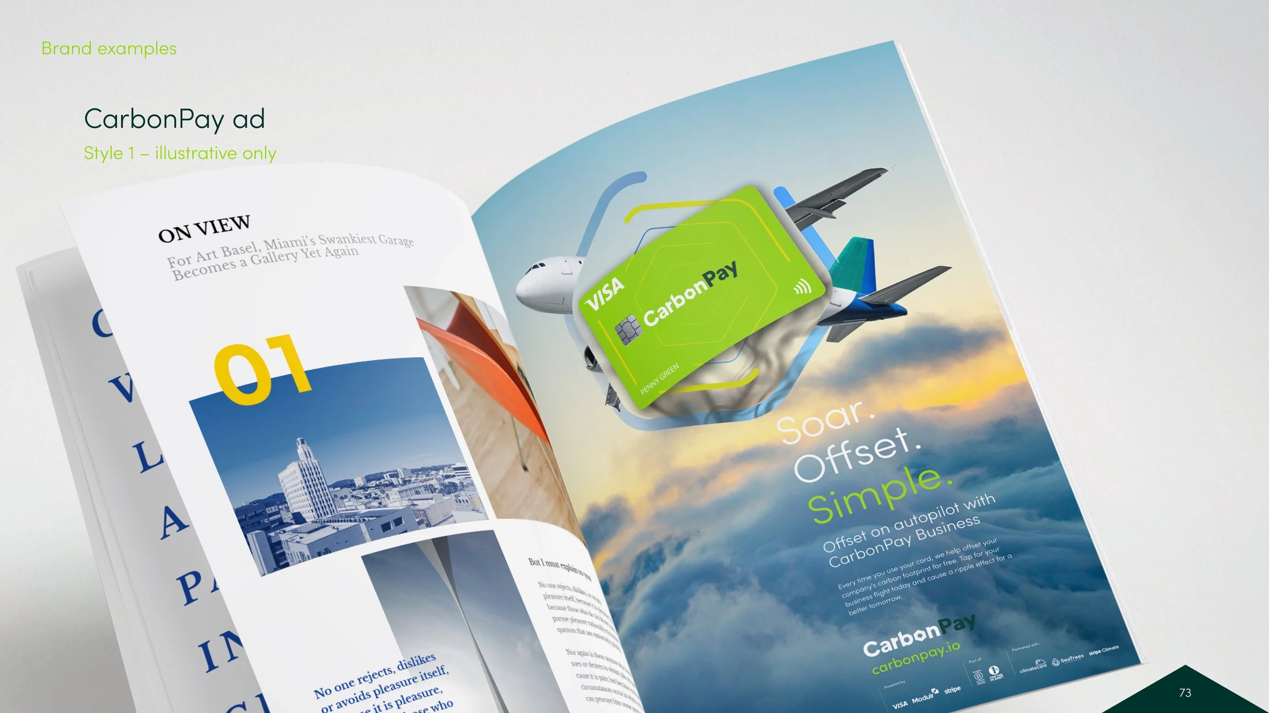
CarbonPay places sustainability at the core of everyday spending – turning every transaction into a small act of accountability.

I helped build the brand from scratch, creating a visual system that balances precision with purpose. The identity extends into a fully considered app experience, designed to give users genuine clarity and control over their environmental impact – without ever feeling like a compromise.

An airplane flying through a cloudy sky, with its silhouette visible within a geometric shape overlaying the sky.
Two contactless payment credit cards, one green and one dark green, with chip and contactless symbols, partially overlapping.
CarbonPay logo with green and dark teal text
An advertisement for CarbonPay Visa card featuring a background of lush green mountains and a message that reads "Reach net zero with 0% interest." The card appears to be glowing with green and white colors and has the name Daniel Underwood.
A smartphone screen displaying the CarbonPay app, showing a digital card and options to hold near reader, with a green background.
A person sitting at a desk, holding a smartphone displaying a Visa Carbon Pay card, with a laptop underneath and a white lamp nearby, in a modern office setting.
Wind turbines on a mountain ridge at sunset, with a lens flare effect and layered mountain ranges in the background.

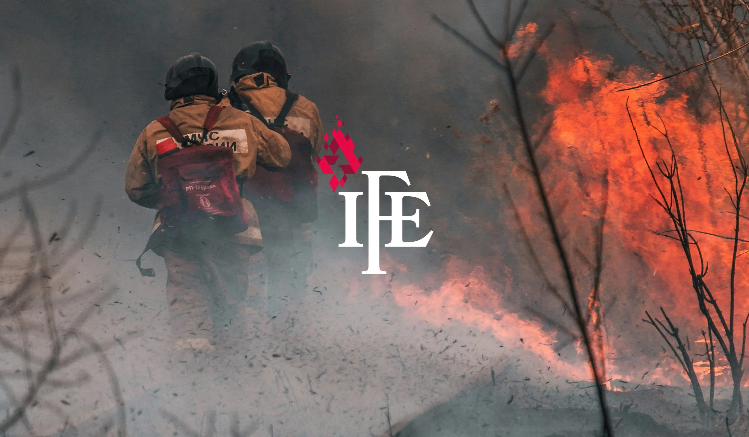
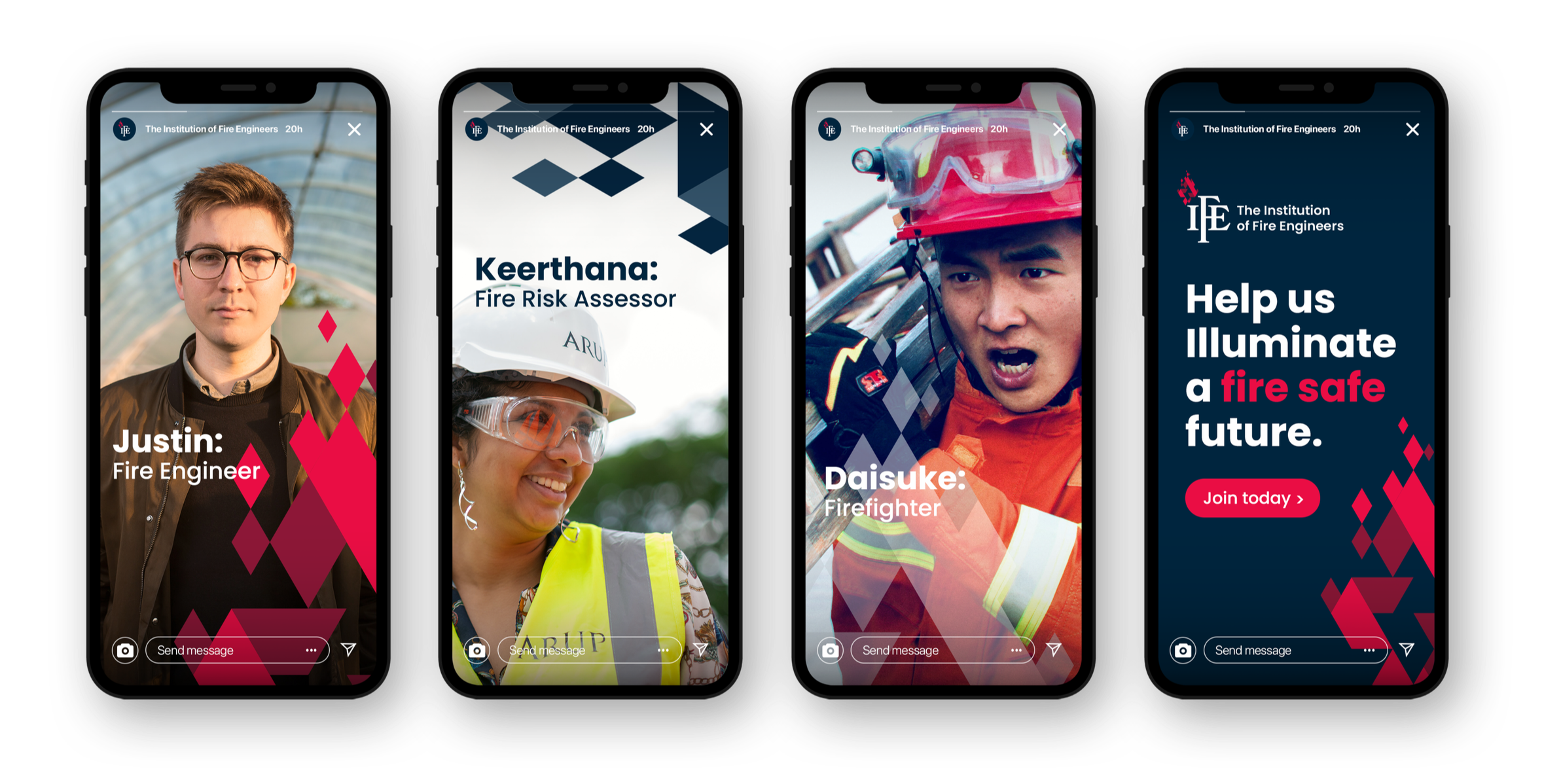
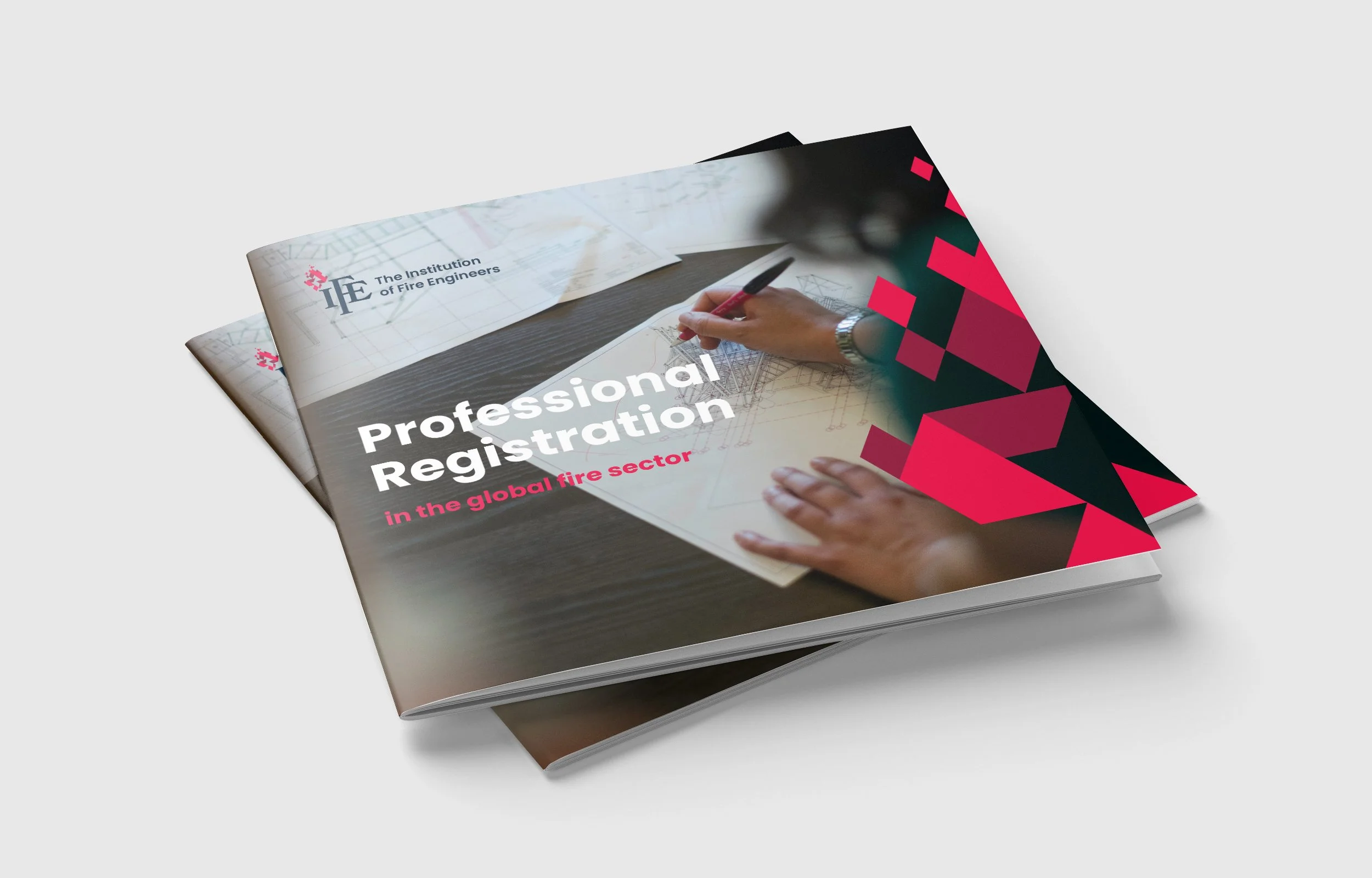
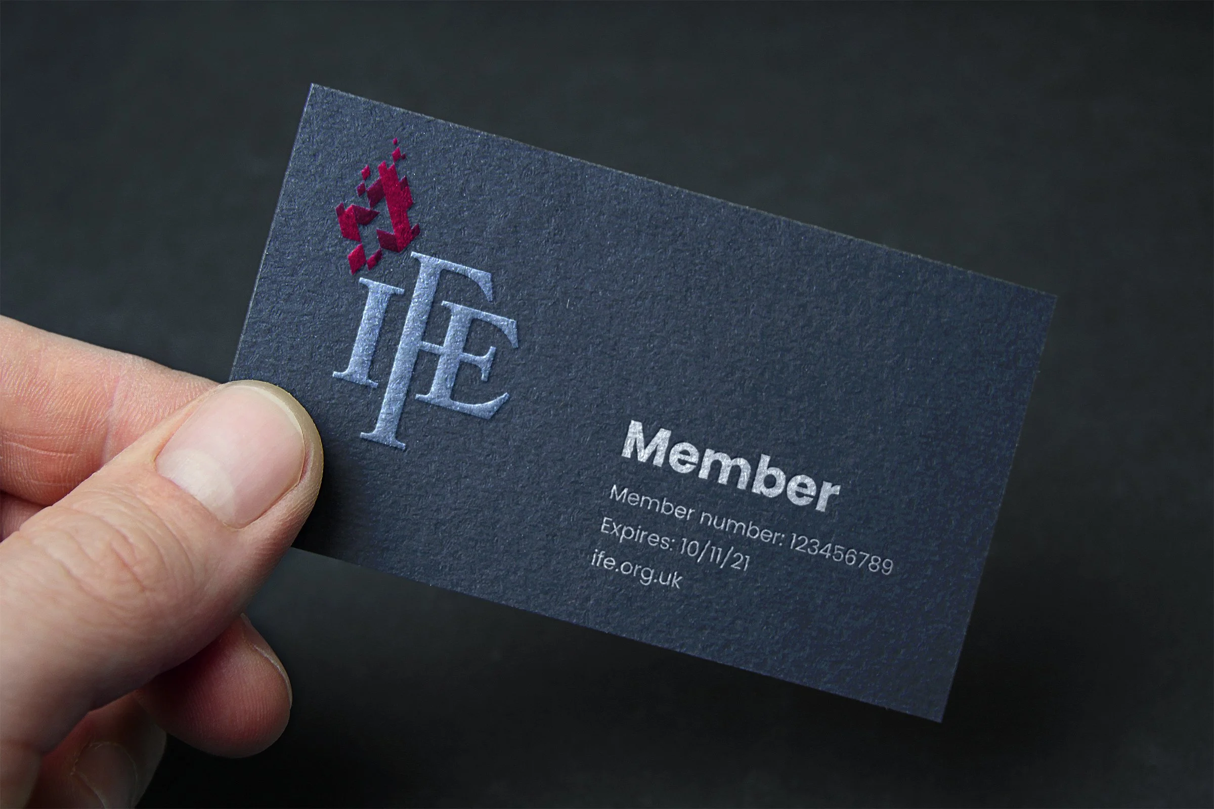
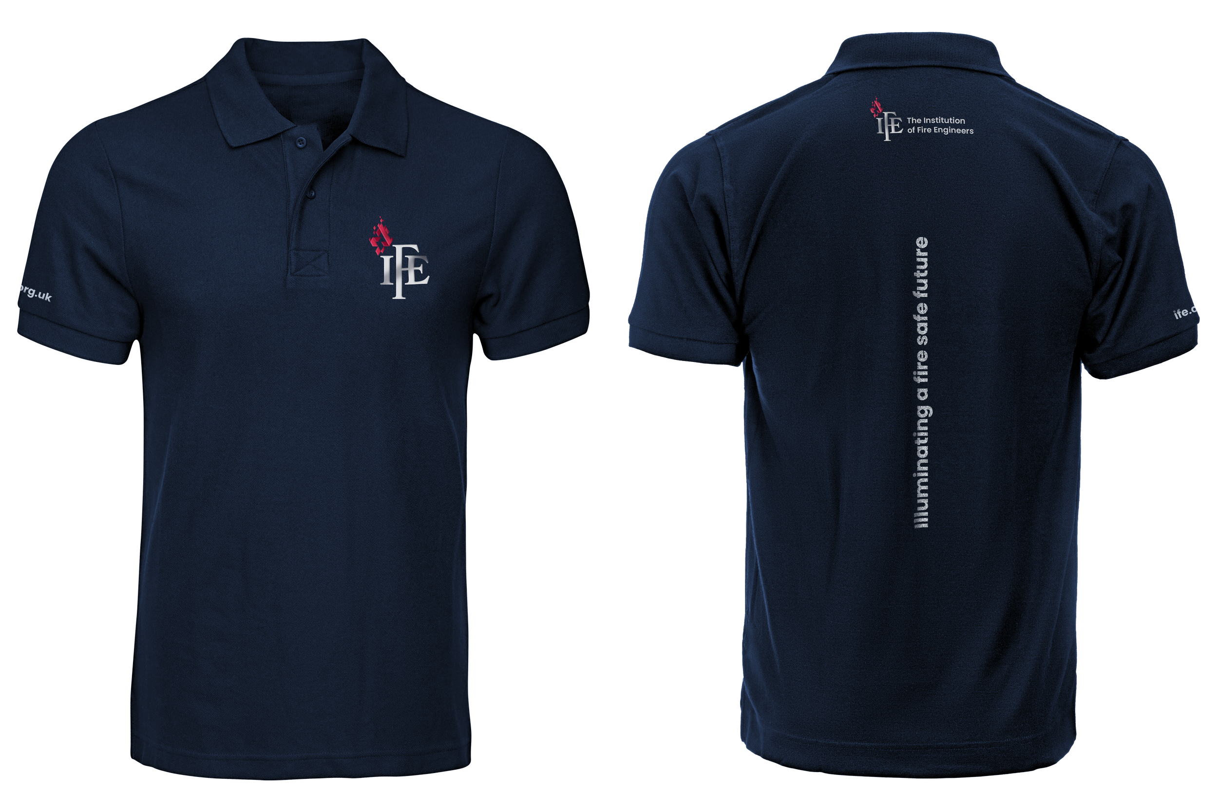
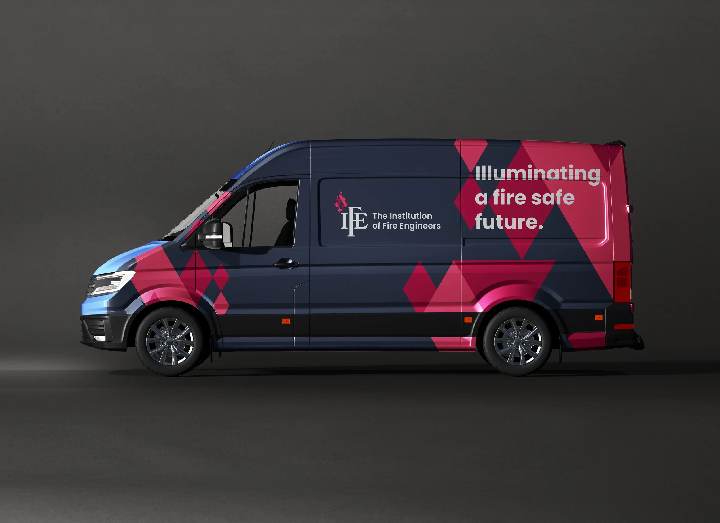
I led the creation of the global brand for the Institution of Fire Engineers – an internationally recognised body dedicated to advancing fire safety and professional standards worldwide.

This was a full visual identity project, from first principles to final execution, designed to reflect the authority, clarity and responsibility that comes with shaping a profession built around protecting people, property and the environment.

The result is a cohesive, assured system that brings consistency to a global organisation – and reinforces the trust that underpins everything it stands for.

A global brand built on trust.

Two firefighters in protective gear facing a large wildfire, with flames and smoke in the background.
Four smartphones displaying promotional images for The Institution of Fire Engineers, featuring individuals in fire safety and firefighting gear, with accompanying text about fire risk assessment, firefighting careers, and inviting viewers to join.
Open magazine titled 'Professional Registration' with a cover photo of a hand sketching architectural drawings on a desk.
Close-up of a person's hand holding a black membership card with a red and silver logo and white text.
Navy blue polo shirt with logo of The Institution of Fire Engineers on the front and back, and the URL 'ife.org.uk' on the sleeve.
A dark blue delivery van with graphics and text promoting fire safety awareness. The text reads, 'Illuminating a fire safe future,' and includes the logo of The Institution of Fire Engineers.

Holy Moly. That’s some tasty art!

I’m part of the team at Tribera in Birmingham – a digital content agency doing some very good things. For one of our clients, Holy Moly in Grand Central, I created a vibrant (and, let’s be honest, pretty fucking ace) set of artwork that leans fully into the brand’s personality.

Quirky illustration

An illustration style developed for Keysoft Solutions…not much else to say really. Cool isn’t it!

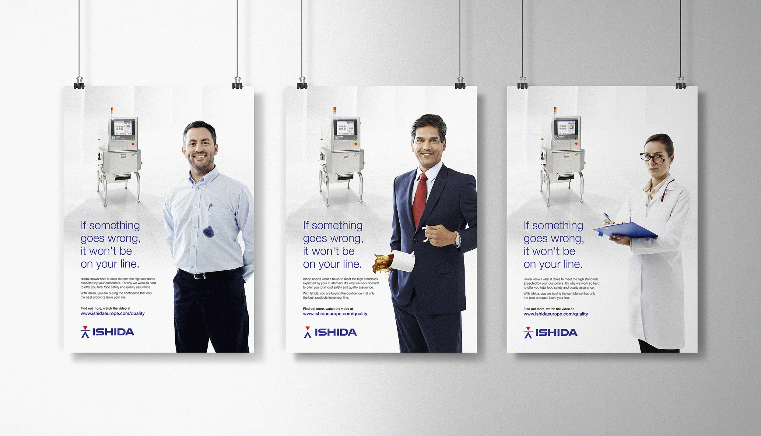
Failure is not an option

We worked with Ishida for years. An amazing client to have with such an open mind when it came to creative ideas and campaigns. They provide food processing and quality control for their customers – we provided exceptional customer service and creative for them…if I do say so myself.

Ishida-Fails.jpg

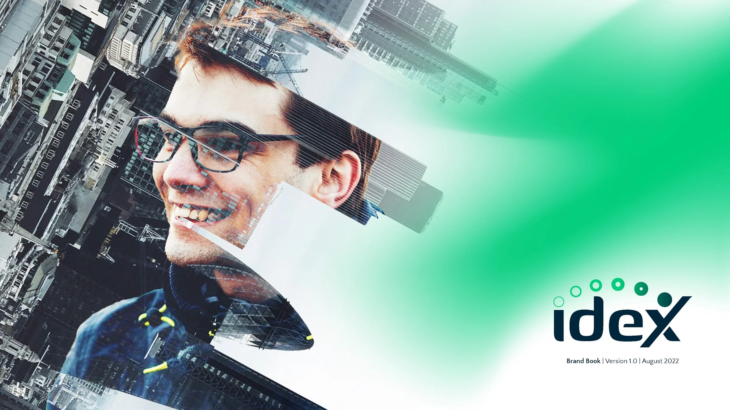
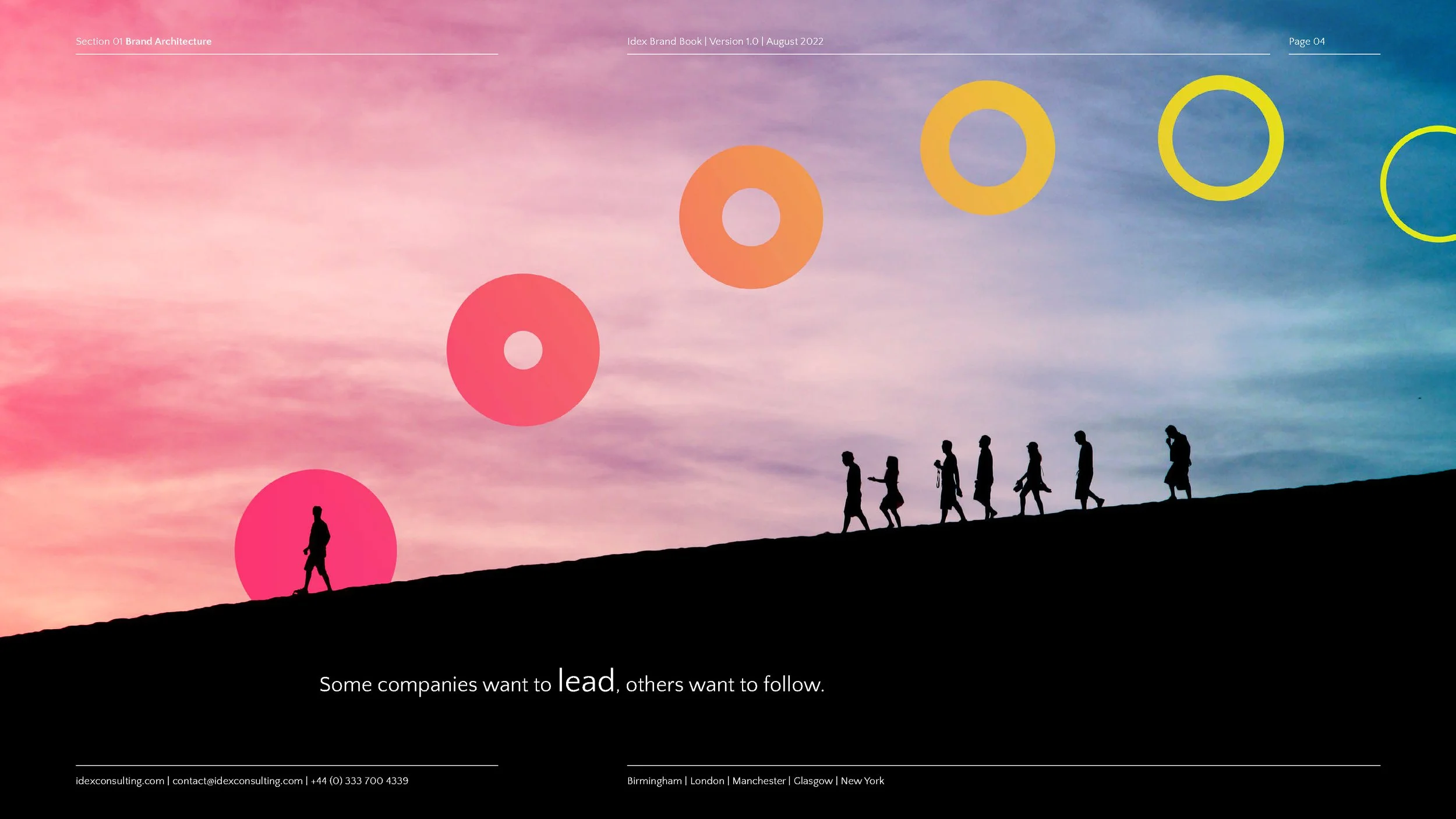
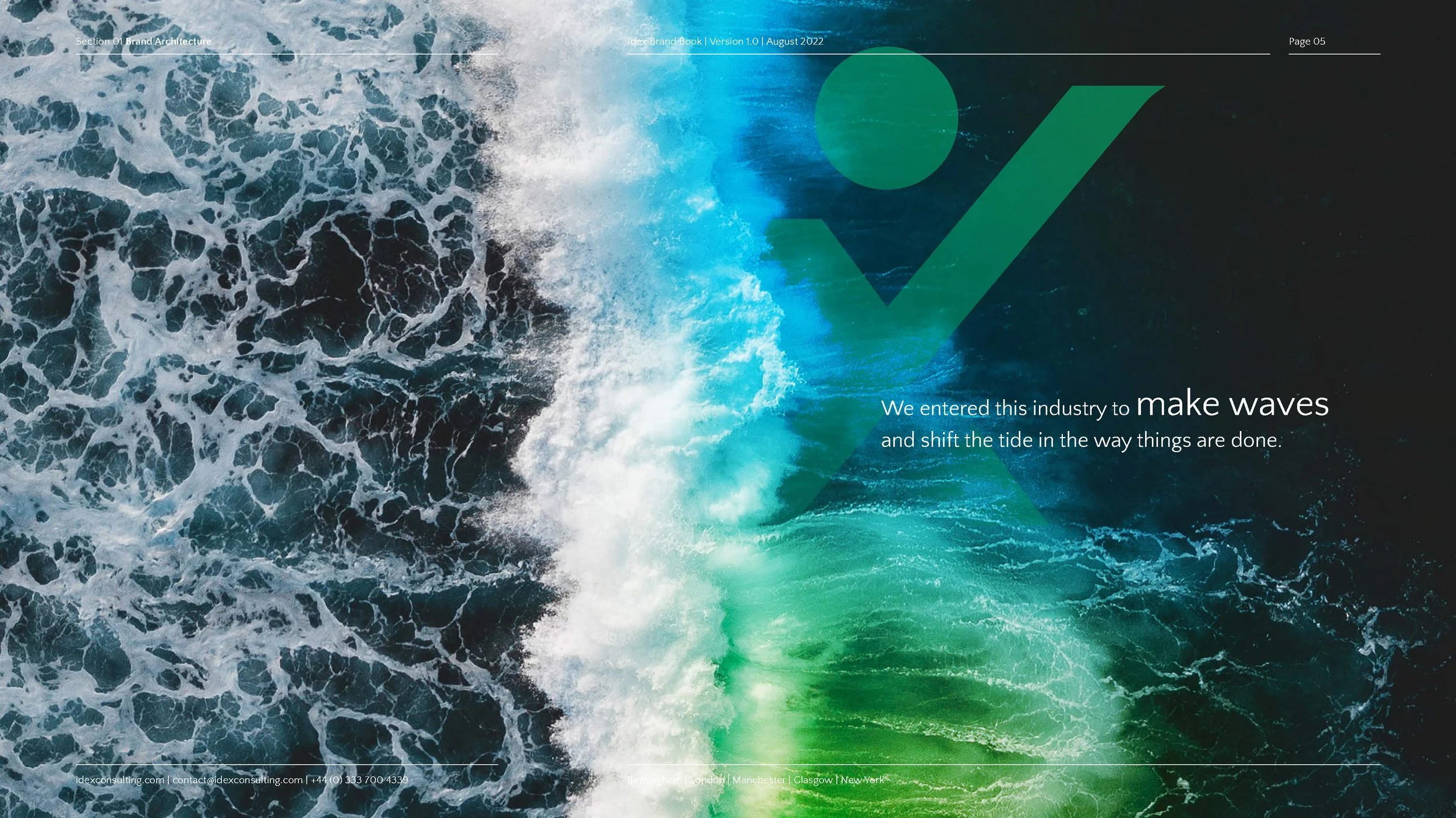
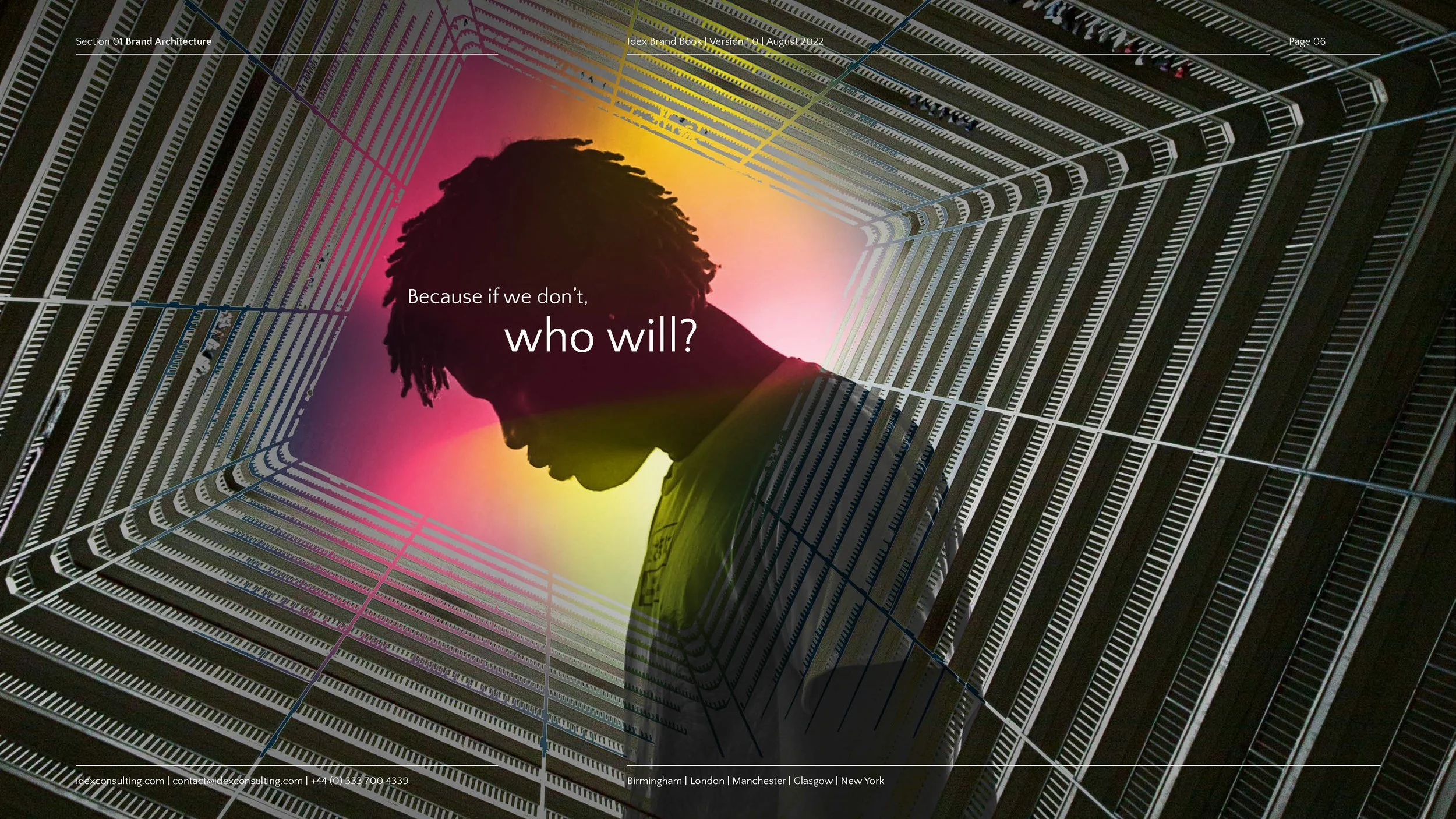
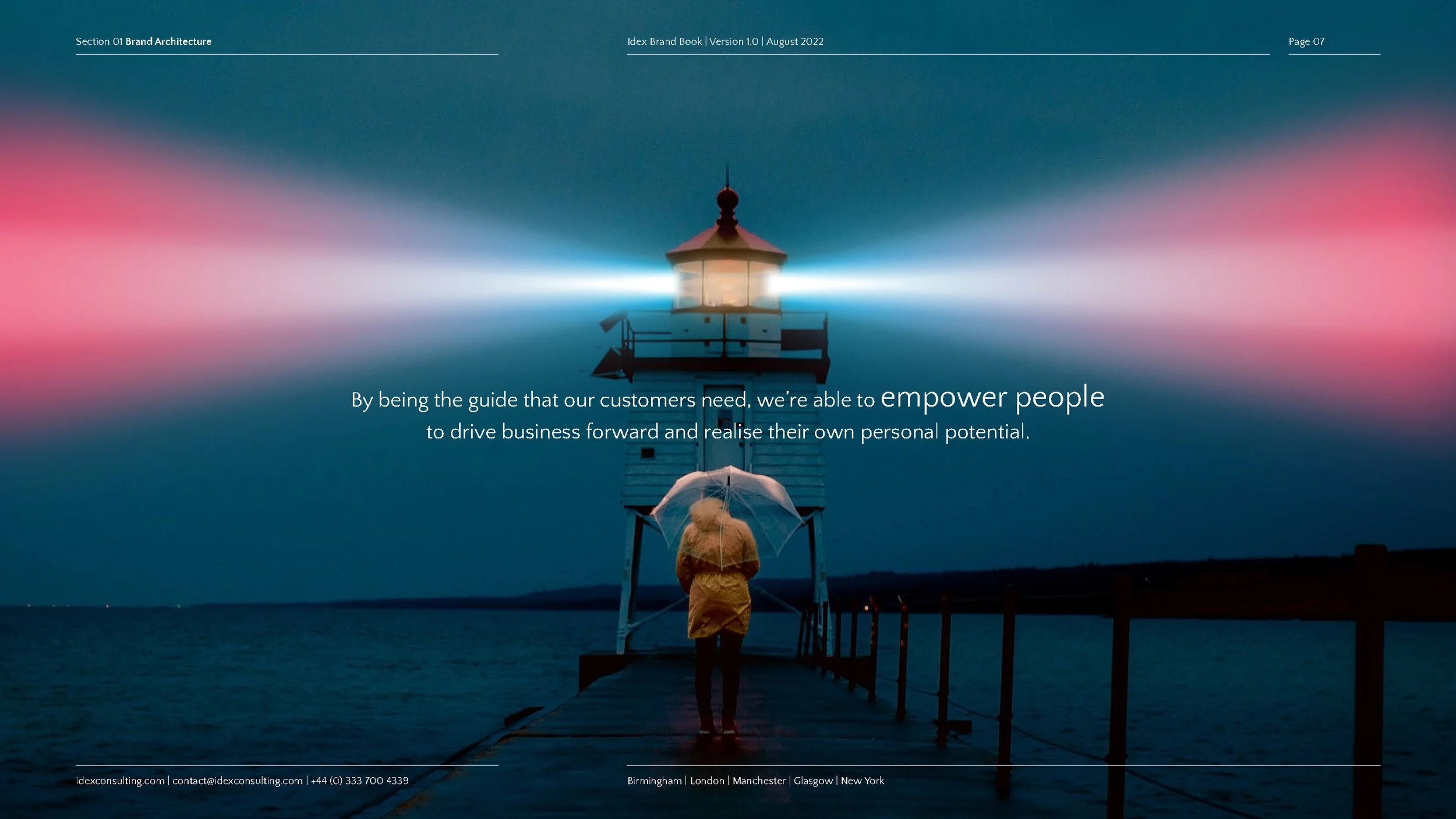
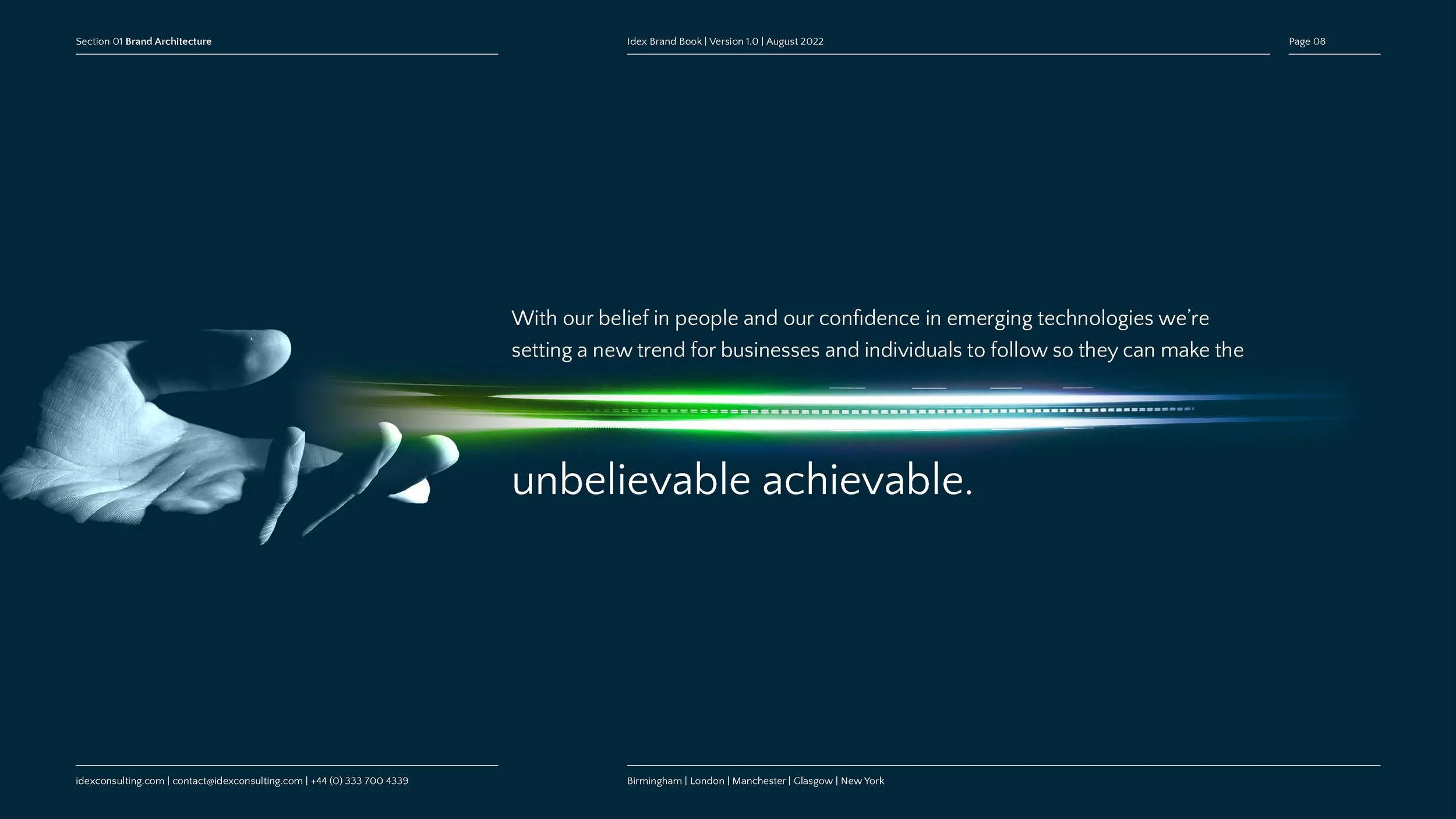
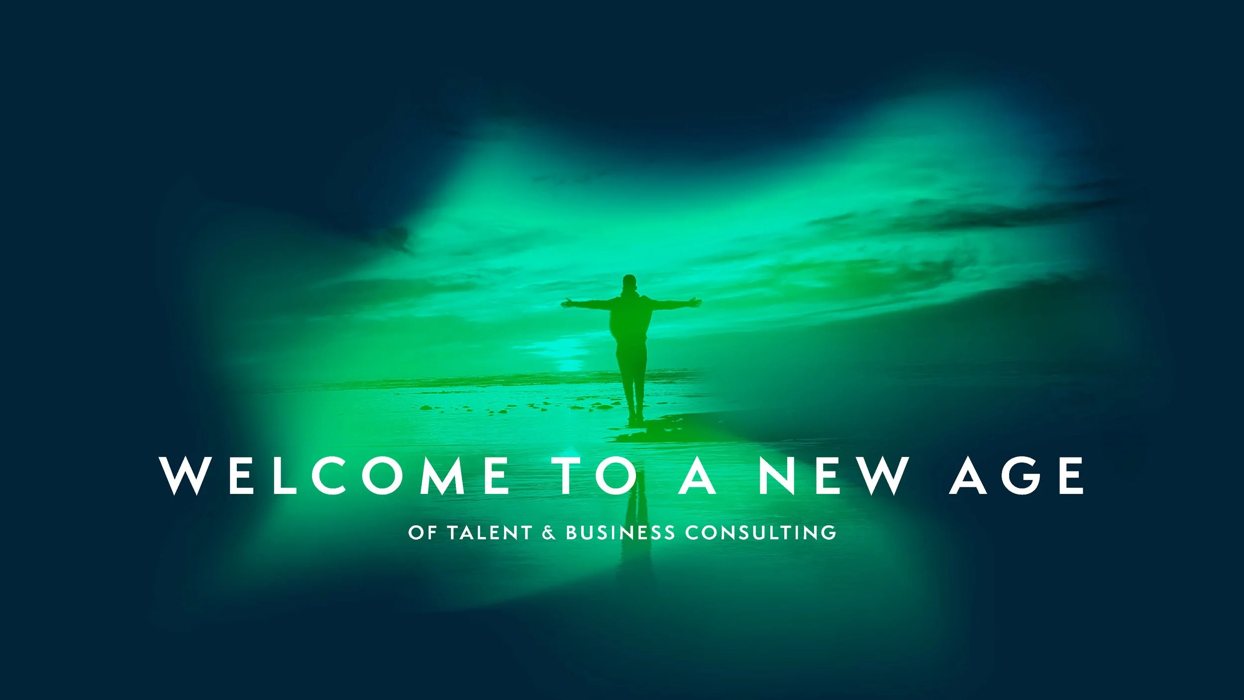
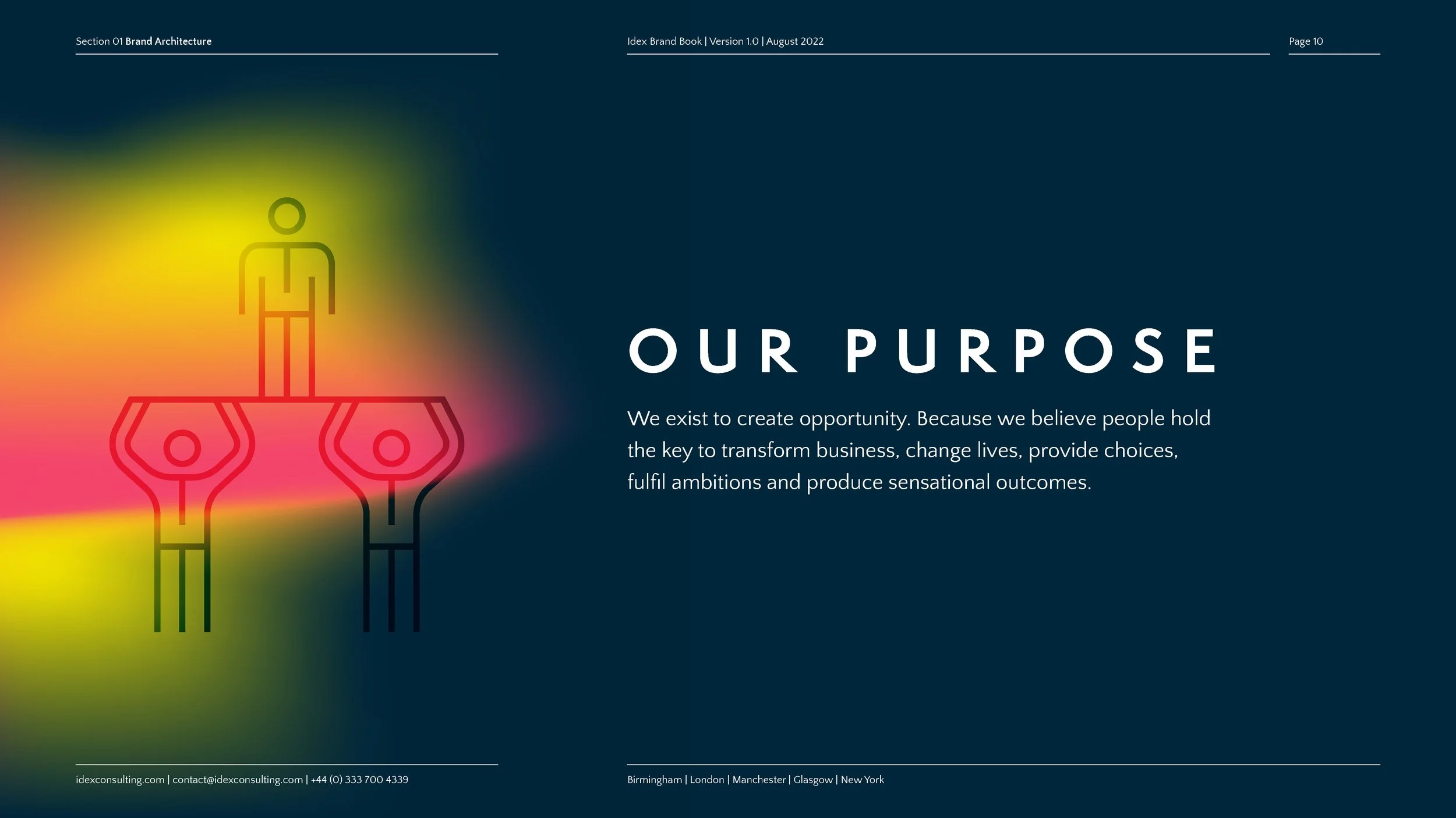
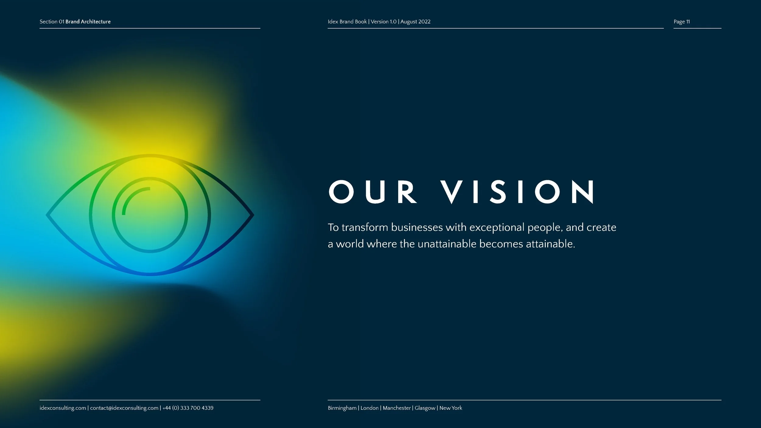
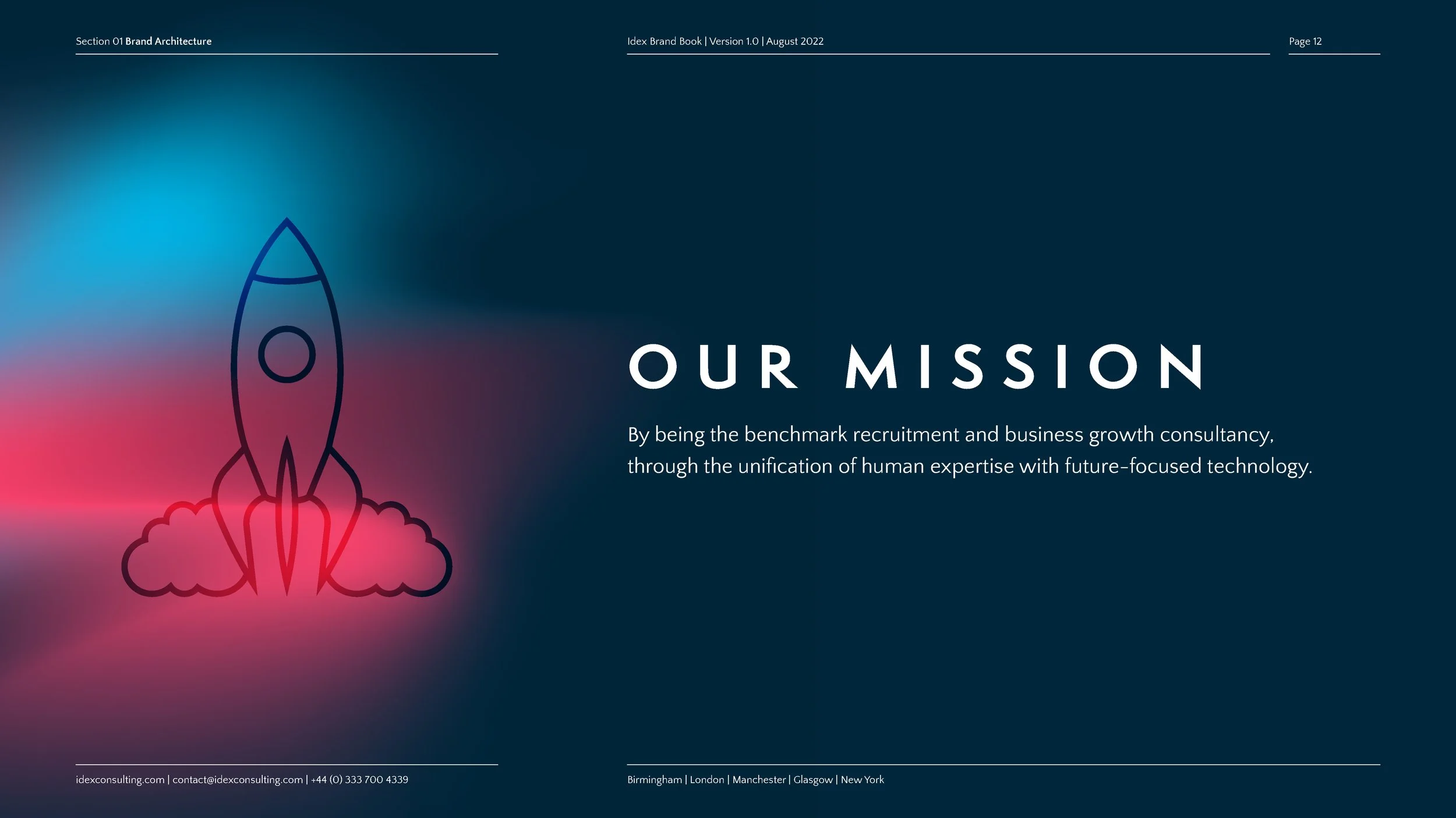
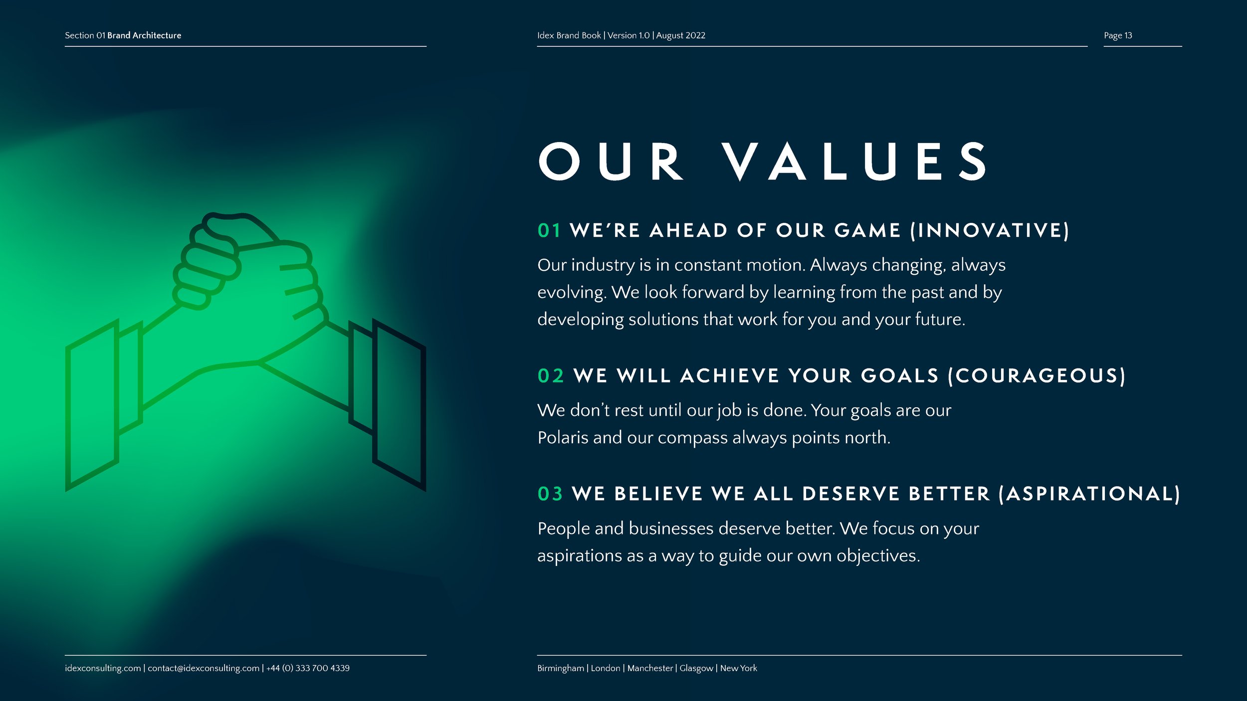
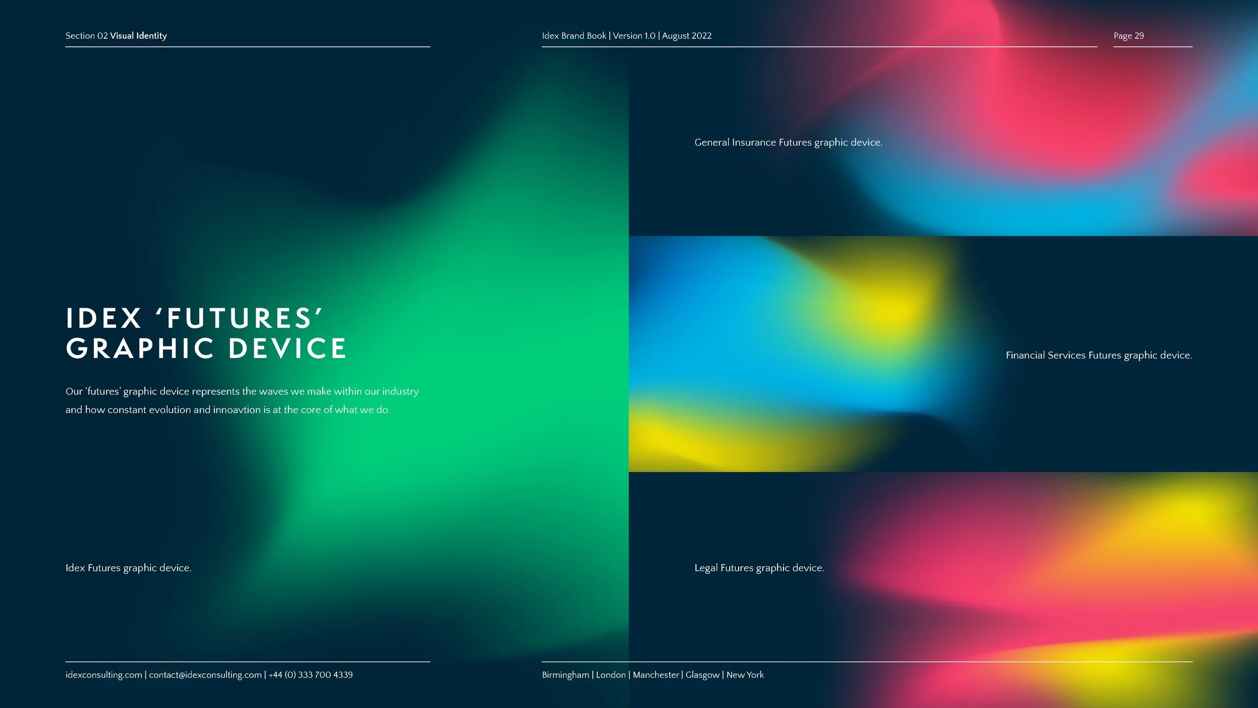
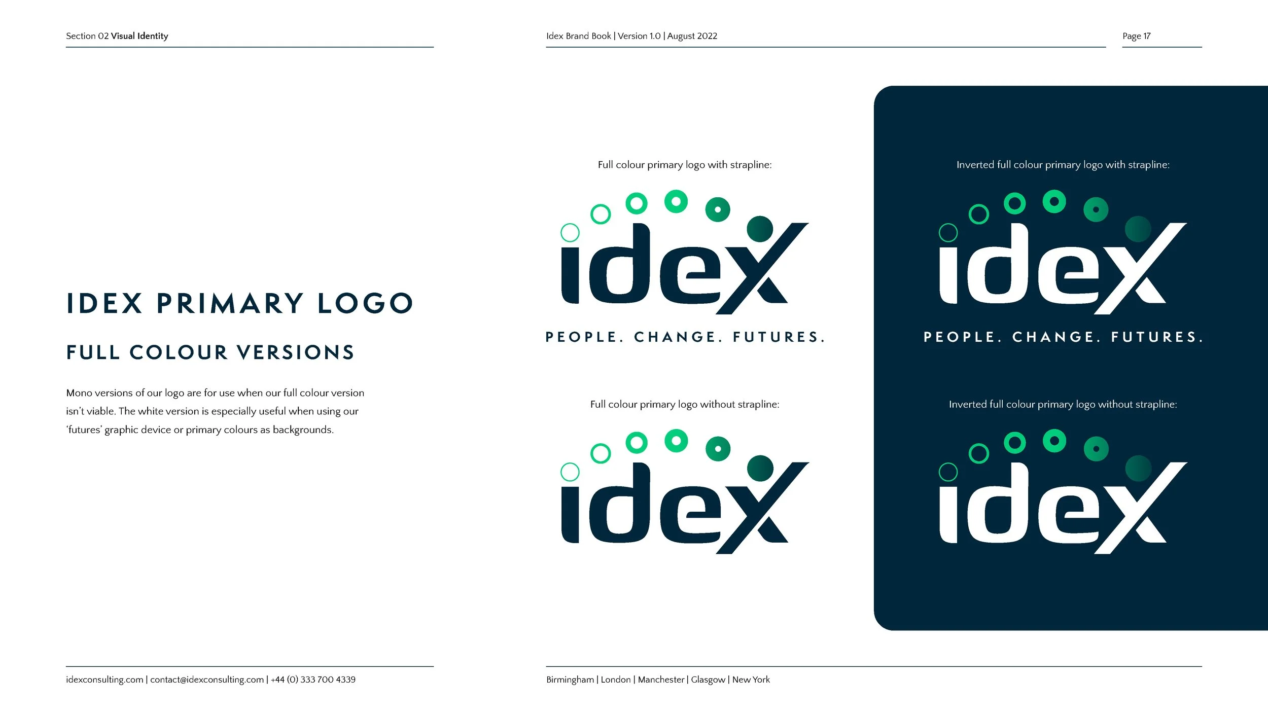
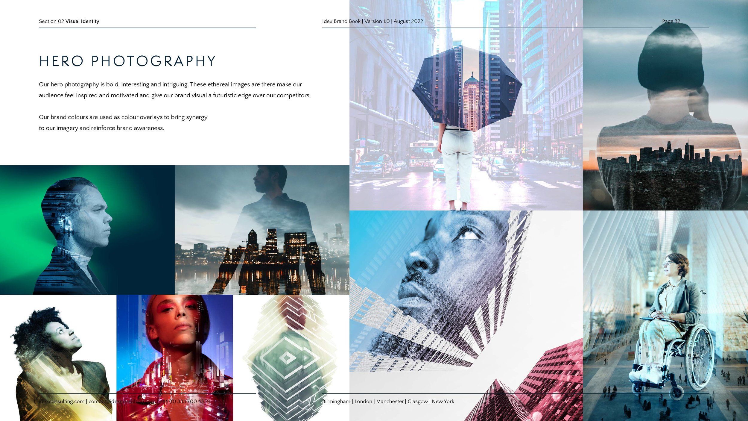
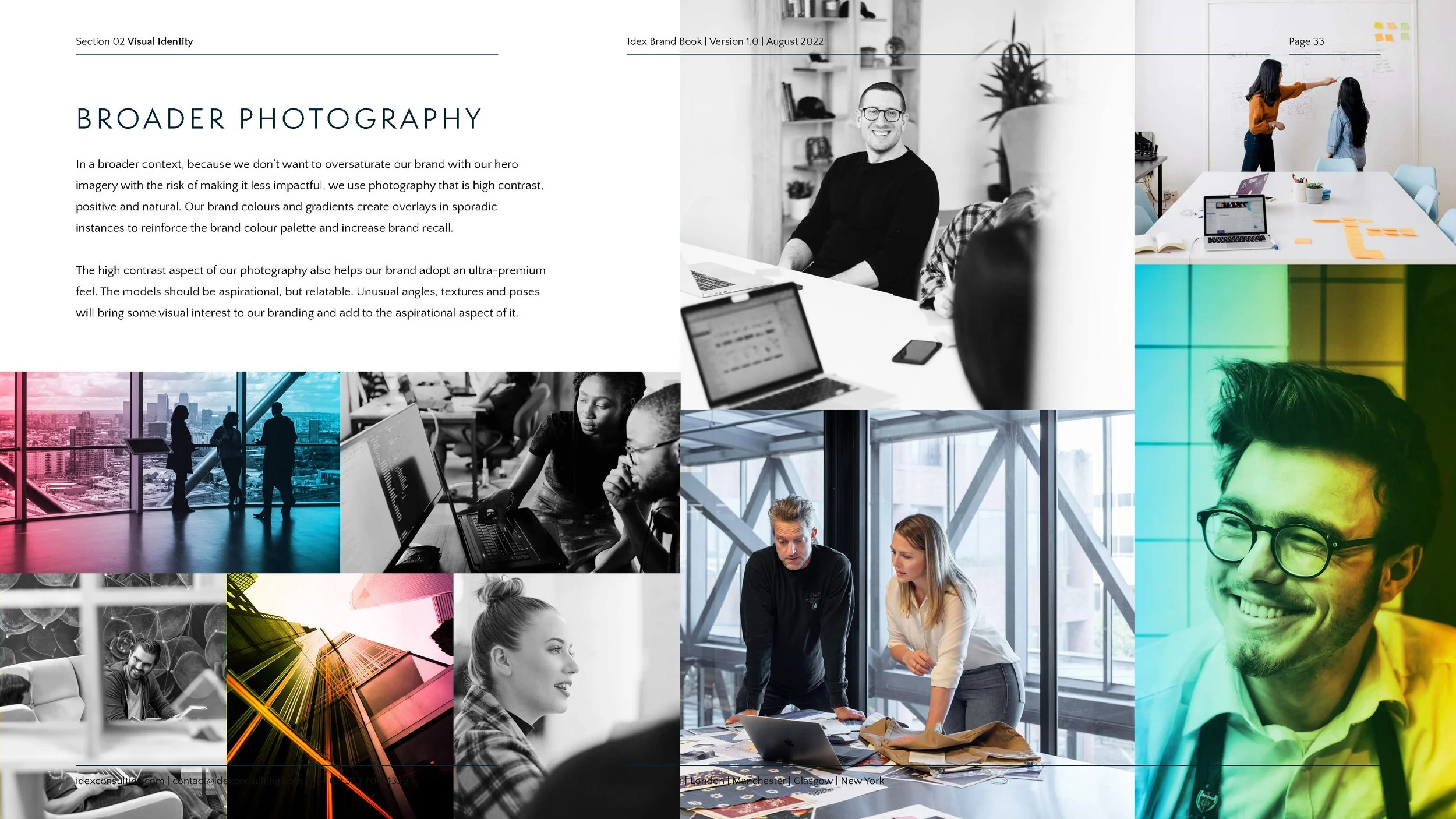
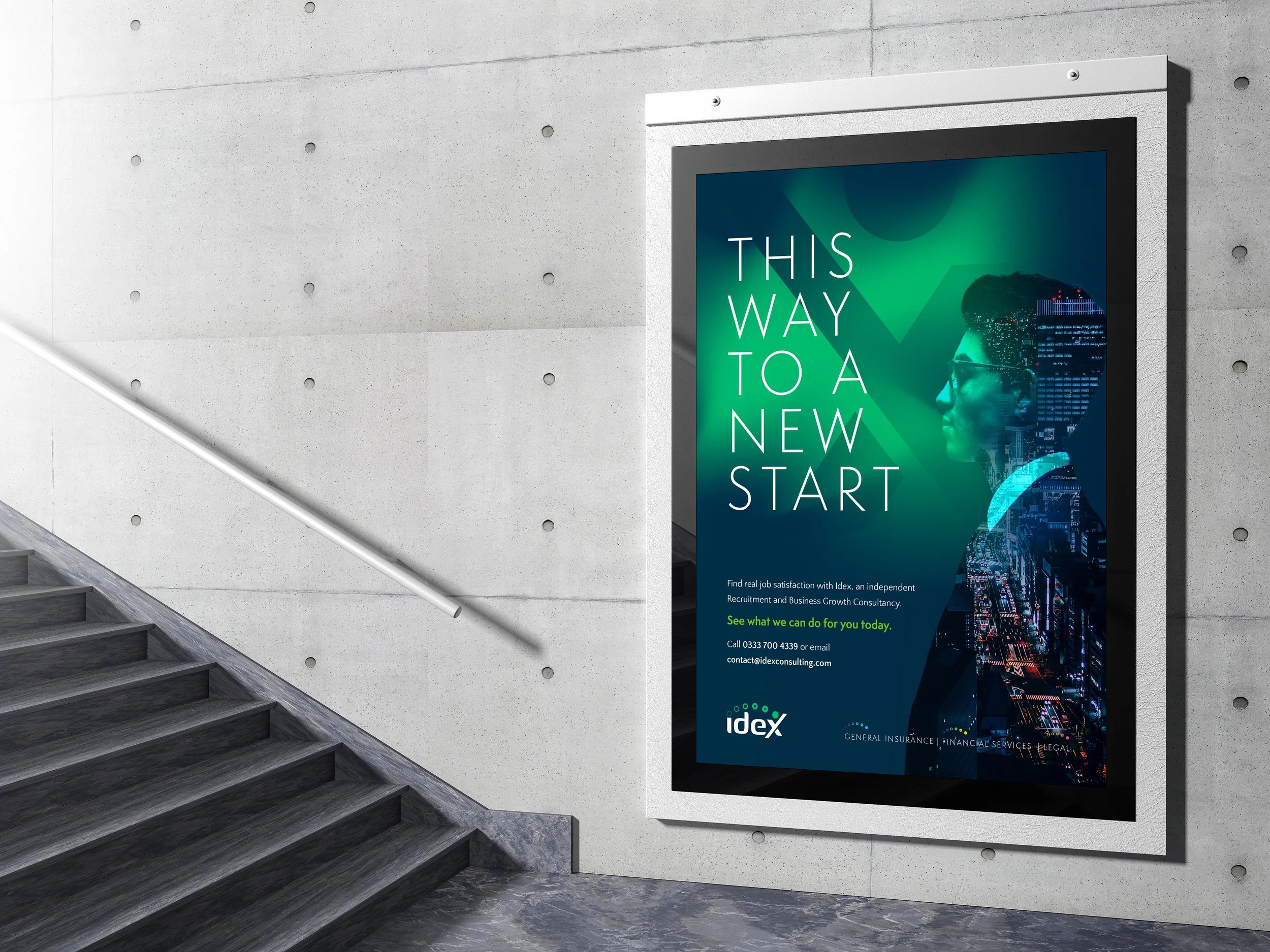
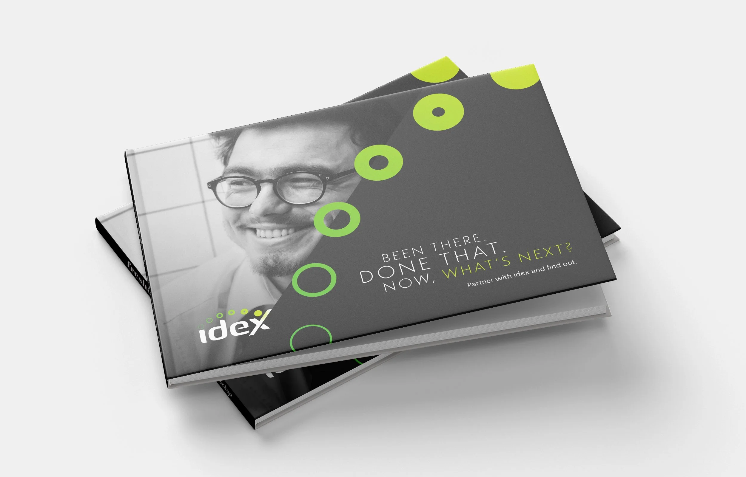
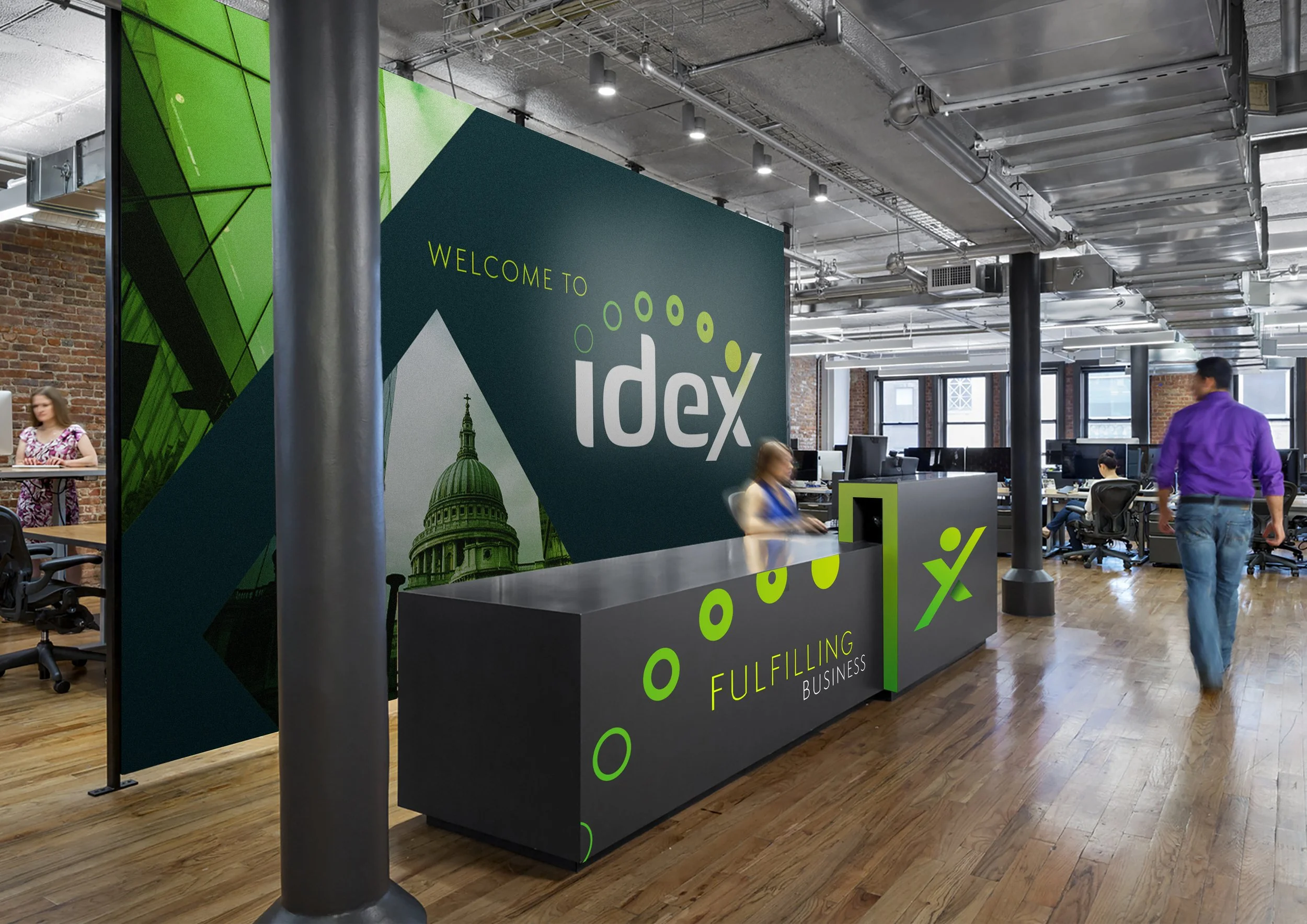
Not your average consultancy.
Finally, not your average brand.

Recruitment isn't glamorous. Insurance is even less so. But IDEX Consulting have spent nearly twenty years proving that connecting the right talent with the right business is actually a pretty serious superpower. They just needed a brand bold enough to say so. I took them through a full branding sprint and built out a complete visual identity – the kind that stops scrolling, earns trust, and doesn't look like every other consultancy on LinkedIn. Boring industry. Anything but boring brand.

Like what you see? Why not give me a call or send me a message. Providing you’re not a robot, you’re pretty safe.